During the month of May we rented the Tobii eyetracker to conduct a variety of studies about online news design decisions. Different designs for displaying “breaking news” and supplemental links were tested. We also looked at three variations of New York Times story level pages (the difference was the intensity and variety of supplemental information links available.) All three of these studies need some time to digest the data (from both the eyetracking behavior recorded and the survey responses by the participants.) They will be reported on in later columns.
But as a little “add-on” study, we asked 34 of the people who did one of the other tests to also take a look at the Washington Post’s “Cuba by Korda” slide presentation.
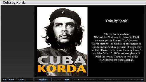
We were interested in seeing how people decided to navigate through this package which included every possible option for moving through the slides.
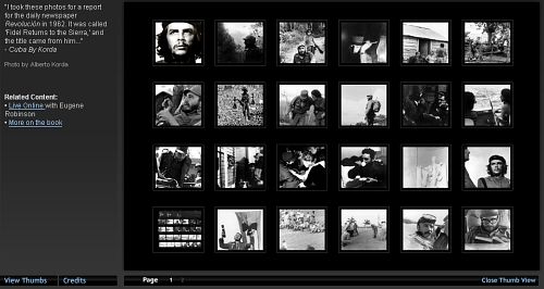
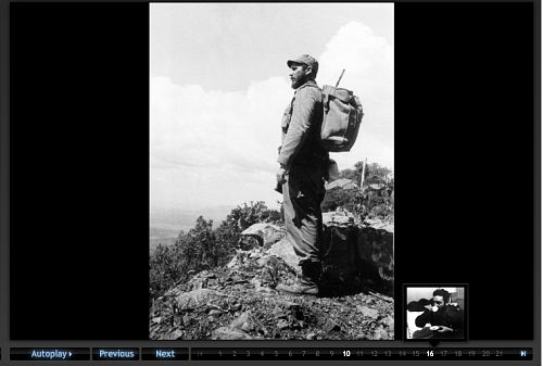
There was a thumbnail view:
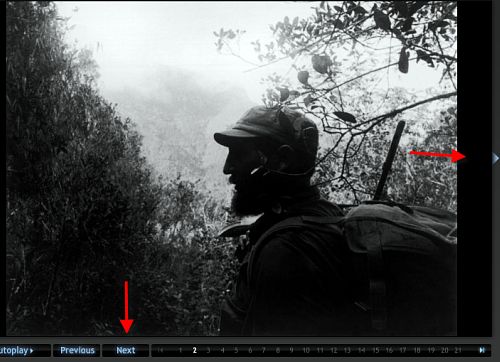
You could click on an arrow next to the photo to go forward or back. Or you could use the “Next” button.
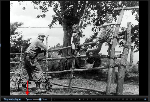
There was an “autoplay” option that let you change the speed of the slide transitions.
Or you could click on the individual numbers lined along the bottom which would reveal a thumbnail of the image associated with that number.
We had a number of questions about use of this complicated navigational suite.
With this study we simply sent people to the site and asked them to look through the package as they would if a friend had sent them the link. There were no instructions about how long to look, just to go through the site until they had had enough. We did not ask them any questions about the experience or their preferences, we just recorded their eye-movements on the screen. Here’s what we found in an analysis of the eyetrack recordings:
Navigation choice
Of the 34 participants, their first navigational choice:
11 of the 34 switched between two different navigation methods, and 3 of those 11 used three methods (not repeating any of them.)
Of the 19 that started with the “Next” button:
Of the 8 that started with the Numbers
Number of slides viewed
The average number of the 40 slides in the package viewed by those who used one method the whole time:
Nine of the 34 participants viewed all 40 of the slides – all of them started with the “next” method of navigating the slides. Seven of those nine used “next” the whole time, the other two went to “autoplay” to view the rest of the stack.
For all the participants – the average number of slides viewed was 23.
Time spent
The average time spent with the slide show package was 2:55. The longest time was 8:17 (a young woman of Hispanic background – carefully read all the slide information). The shortest was 0:48. With these outliers removed, the average time spent was 2:49.
For people who stayed with one method, here’s the amount of time they spent with the slides:
Linearity
One of the possibilities in designing online presentation is the option of moving through material linearly or non-linearly. Two of the navigation options facilitated non-linear exploration of the material – the “numbers” and the “thumbnails.” No one started with the “thumbnails” and of the eight who started with the “numbers” half of them clicked the numbers in order (linearly), the other half clicked around in random order. Of the half that clicked linearly, the average number of slides viewed was 20.75. Of the half that clicked randomly, the average number of slides viewed was only 6.5.
Reading
We viewed all the eyetrack recordings to see whether the participant read the related text about each slide.
There was no predominant method of viewing the slides that resulted in a more careful reading of the text. Of the eleven seen as carefully reading the text, 4 used the “number”, 3 used the “next”, 3 used the “arrow”, and one used “autoplay”
Observations
In terms of practical advice, this observation of navigational methods use makes clear that if you can only have one navigation method – the “next” method, moving linearly through the set of slides is the one to use. It was the primary choice of the majority of the participants and resulted in viewing the most slides.
However, if amount of time spent with the story package is your primary goal, people who clicked from slide to slide using the “arrow” spent almost a minute longer than the “next” users.
The reason for some of the other observations (for example, why no one selected the “thumbnail” view as an initial navigation method and why so few (2) selected autoplay) is not known – we did not ask people about their choices (or about their possible confusion about the choices.) This would be an interesting project for a future time – to do more of a “think aloud” session about people’s navigational choices. But this observational study does provide some insights into the choices made by people faced with a variety of methods for navigating to through rich and deep slide shows.
But perhaps the most interesting observation was the very low level usage of the non-linear approach (and when it was used, how few slides were observed.) Is the linear orientation to looking through material so hard-wired into our media usage that it is, and will continue to be, the preferred way to take in media? Even when it was visual information – as this was – and did not logically need to follow a narrative thread – people preferred to move through in the order it was presented. What does this observation tell us about innovation in digital storytelling and our audience’s tolerance for new design paradigms.


How old were the subjects? How web-savvy?
There
The results make sense to me. The readers won’t want to have to decide what order to view things in, they just want to see what you have to show them. It’s easier just to have the content provider provide a sequence.
Just because you can provide a bell or whistle doesn’t mean that the reader wants it.
I also believe that having navigation controls that do not move as you browse from image to image encourages users to stay longer. The ‘next’ button may be the top choice for this reason – click through at your own pace, without having to take your attention away from the images.
it is good to put slide shows in a webpage but professionally speaking, slide shows make page loads slow, so it’s better to link each pages with seperate links. Apex College