Eyetracking points the way to effective news article design

When one of world’s best-known usability experts, Jakob Nielsen, conducts eyetracking research to test what his usability work has shown, the results generate some beneficial tips for online editors. This is what happened in late 2005, when Nielsen and Kara Pernice Coyne, the Nielsen/Norman Group’s director of research, conducted an eyetracking test with 255 people in New York City.

With a little more than half of the participants (63 percent) ages 30 to 49, the test generated results applicable to the target audience for most news sites. Additionally, 20 percent were 18-29 and 16 percent were 50-64. Fifty-eight percent were female, 42 percent were male. Every test subject was given 50 tasks to complete. Sessions with each test subject lasted about one to two hours.

Coyne (who we interviewed for this column) stresses that crucial to understanding the testing results is an awareness of the user’s motivation or goal behind each task. Some of the testing scenarios included asking the user to “read the news” or “read/learn”, making a number these results particularly helpful to journalists. She said eyetracking is valuable in these cases because it indicates not only where our users look, but where key usability problems exist.

“[With eyetracking] we can see that a user may navigate the page of an interface that houses the info she wants,” she said, “but if the text is poorly presented, or the navigation is cluttered, or there are too many superfluous images so she cannot easily find what she needs. This is a lost opportunity.”

We’ve featured three of the more interesting journalistic study results below.

Featured finding #1:
Rewrite + reformat = remember

What if you could engage users in a story for about half the time, yet have them remember about 34 percent more of the content? That’s exactly what one test showed. Spending less than two hours rewriting and reformatting a story about New York City restaurants really paid off according to this study.

The image below shows the two stories tested:

Image
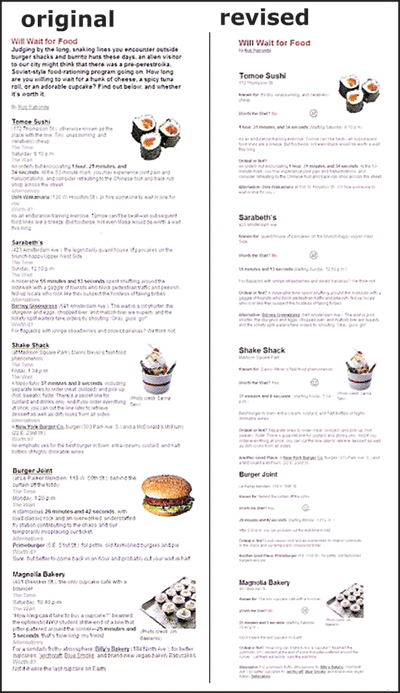
The original version (left) was revised to increase white space, make the main idea concise, remove unnecessary images, shorten lines of text and add a graphic for each restaurant ranking. (Nielsen/Norman Group images, used with permission)

The eyetracking data is featured in the image below. Red areas indicate the areas where the fixation length (or the length of time the users spent look at that area of the screen) was longest. Dark areas indicate low or no fixation length on that part of the presentation.

Image
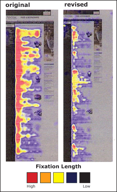
Users spent a longer amount of time (about one minute) viewing the original version of the content (left) but remembered 34 percent less than those who received the reformatted story (right). In both cases a greater amount of time was spent on the left-hand side of the page. (Nielsen/Norman Group images, used with permission)

Nielsen and Coyne also ran a similar test with more complicated content – a story from the New York Times about Australians receiving the Nobel Prize for Bacterium work. The results were similar. Changing the story presentation to text with:

  • bulleted items
  • subheadlines
  • tighter writing
    increased comprehension by 12 percent, with readers of the reformatted text indicating that they were more satisfied with the experience.

    Coyne calls these results “cool,” but adds that they were not unexpected.

    “We have seen many striking results like this over the years,” she said, “so were not tremendously surprised by it. It makes sense too. If a user is comfortable, not hindered by clutter and superfluous words, and can scan the main points, he will get the summary of the article quickly and easily. Formatting for the Web goes a long, long way.”

    So what?
    What do these results mean for online journalists? Take the time to rewrite and reformat print stories for online if you want users to:

  • get through a story more quickly
  • remember more of the content
  • be more satisfied with the story experience.

    Coyne’s direct advice for online journalists includes making sure that no matter what, all pages and articles have clear well-written headlines at the top that users can scan to:

  • see what the article is about
  • confirm they are on the page they want to be on.
    “Without [good headlines and subheadlines] people … need to read the text to figure out what the article is about,” she said. “But some people, many people, simply won’t do this. They will just move on.”

    She adds that overall, online stories can benefit from more concise writing, front-loaded with the main point first.

    “Assume people will only read the first few words of a line,” she said, “so bulleted lists are always good, as is bolding or creating links from important, information-bearing words.”

    Featured finding #2:
    Precise and relevant editing = successful design

    On home pages and story level pages, eye patterns indicated that text that isn’t precise and images that aren’t information-bearing don’t get looks, amounting to wasted space. For example, here is a test Web page where users were directed to “read news.”

    Image
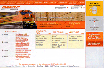
    This BNSF Railway page was tested by Nielsen and Coyne. Users were sent to this page and directed to “read news.” (Nielsen/Norman Group image, used with permission)

    The hotspot below shows that the image of the train did not get eye fixations and that users eyes traveled around the page – not directly to the “top stories,” which is where the site’s news is located.

    Image
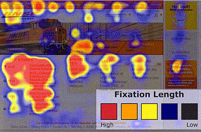
    Users did find the “top stories” and spent the most time there, but only after traveling the page and making fixations in other areas. (Nielsen/Norman Group image, used with permission)

    A different version of the BNSF page also was tested. The page and its corresponding hotspot are featured below. Notice that the longest eye fixations are on the area labeled “News Releases,” where the main stories are and where the site designers intended to direct them. Users seemed to find exactly what they needed and stay there when information was more clearly labeled. Again, the more “decorative” image gets no fixations.

    Image
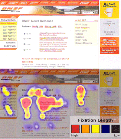
    Another page of the BNSF Railway site and its corresponding hotspot. (Nielsen/Norman Group images, used with permission)

    So what?
    These results indicate that every item on a news Web page needs precise and thoughtful editing. As indicated above in Featured Finding #1, users will read only the two-to-three words of a headline (a result that also was found in Poynter’s Eyetrack III study, http://poynter.org/eyetrack and seen in the hotspots from the first Digital Storytelling Effects Lab’s initial study, http://disel-project.org.)

    Moreover images with little information are ignored. (More on this in next section.)

    Coyne’s top three suggestions for online news designers are:

  • present text in a way that is easy to scan on the Web
  • create a simple navigational structure
  • replace useless graphics with useful ones or with white space.

    She adds news organizations need to stop taking their design cues from their print ancestors, even though a motivated user may put up with a poor Web design.

    “[News Web sites] need to reformat for the Web medium,” she said. “But, users who are very interested in an article will read through it, even if it is presented as a wall of text. So the print format is not the worst for these very motivated users.”

    Featured finding #3:
    Photos edited for relevance = photos viewed

    In the case of Web design a picture isn’t always worth those thousand words. According to Coyne users treat pages with superfluous images like obstacle courses: The images create barriers to content. Moreover, Nielsen and Coyne concluded that images appearing unneeded, at least peripherally, will be erroneously tuned out.

    The types of images that get attention share these attributes:

  • Related to the content
  • Clear
  • Feature approachable people (clearly can see faces; people shown are smiling/looking at the camera)
  • Feature areas of private anatomy.

    In addition, the team says that individuals look at “real people” more than they do at images of models. Most assume that content that features models are advertisements, so they avoid it.

    Take a look at this page from dancworks.com. Users were given the task to find out more about Mickhail Baryshnikov. Their eye traveled around almost all parts of the page, but the photo, which was more decorative than informational.

    Image
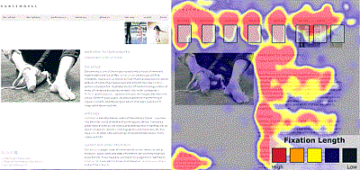
    The danceworks.com site features an image of a dancer’s feet, which gets no fixations. (Nielsen/Norman Group images, used with permission)

    Conyne recommends designers avoid the generic pictures that are often used just for the sake of having a picture.

    “For example,” she said, “if an article is about a signature meal at a restaurant, say a tuna dish, display a scrumptious-looking picture of the plate of food. Don’t show a generic picture of a spoon and fork, as many sites do.”

    When photos do contain people related to the task at hand, or the content users are exploring, they do get fixations. However, gender makes a distinct difference on what parts of the photo are stared at the longest. Take a look at the hotspot below.

    Although both men and women look at the image of George Brett when directed to find out information about his sport and position, men tend to focus on private anatomy as well as the face. For the women, the face is the only place they viewed.

    Image
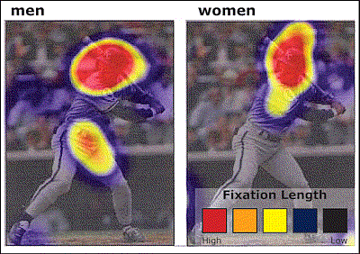
    This image of George Brett was part of a larger page with his biographical information. All users tested looked the image, but there was a distinct difference in focus between men and women.

    Coyne adds that this difference doesn’t just occur with images of people. Men tend to fixate more on areas of private anatomy on animals as well, as evidenced when users were directed to browse the American Kennel Club site.

    So what?
    These results provide tips for selecting photos.

  • Know your audience
  • Know the accompanying content and how photos relate to it. Is it decorative or informational?
  • When choosing between equally informative photos of people, be sure to use ones of “real” people, smiling, looking at the camera — not models which tend to been seen as photos accompanying ads.

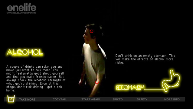
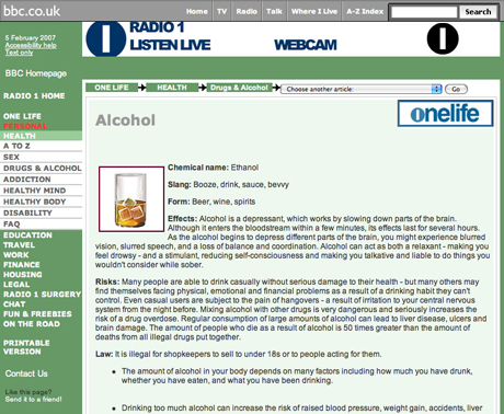
    According to Coyne, sites that do design well include NYTimes.com and TheOnion.com.

    “I am used to The New York Times,” she said. “But even more than being used to it, I like the content and the way they present it. The titles are succinct and look clearly like links- blue, bold. The images are crisp. The text is legible. All the most important information is there on the homepage, as opposed to the BBC.com where you need to click around to get any real information. The Onion also packs a lot of headlines on the page, so you can scan a lot before you choose to read further. That’s nice.”

    Coming in April:
    An interview with Poynter Eyetrack ‘07 researchers.

    Coming in May:
    DiSEL research results about:

  • the design and placement of “Breaking News” and supplemental links
  • how people move through different slide show designs
  • Multimedia storytelling: when is it worth it?

    One of the greatest opportunities of multimedia journalism is the ability to make different design choices. Although most online organizations present digital derivatives of their “parent” products – newspaper sites present columns of text, radio sites feature audio files, and TV sites provide video – we are seeing an increase in the number of sites embracing all design options. Radio sites are complementing their audio with photos and/or text, newspaper sites are presenting video and audio slide shows along with their text, and TV stations are supplementing their video pieces with text stories.

    Increasingly, news organizations are challenging themselves and their staffs with stepping outside of their format expertise and trying to produce news packages that take full advantage of the array of media formats available. Online news sites are trying to integrate different media types into the story package – creating rich multimedia experiences for their audience. Exploration in the use of Flash helps designers create a common interface that transitions easily from graphics, to video to photos to audio without interrupting the user.

    Creating these rich media experiences is a commitment of time and specialized talent that news organizations cannot – and should not – afford for every story. This is the biggest challenge for news designers: Given all the design options now available, how does one evaluate effort over return? When does an integrated, interactive story work best in terms of users’ enjoyment and/or comprehension? When is it warranted to help with understanding of the topic? Bottom line, when is it worth it?

    In this column we will find and report on the beginning efforts to research and evaluate story design effects on news audiences. In this month’s column we discuss the findings for the first project of our research consortium – DiSEL – the Digital Story Effects Lab.

    Comparing Static / Passive Text and Dynamic / Active Multimedia Stories

    DiSEL study: Overview

    In 2002, working with a graduate student at the University of Minnesota, we attempted to “catalog” the areas where design decisions could be made when crafting stories online. These “Elements of Digital Storytelling” (www.inms.umn.edu/elements) looked at a variety of attributes of digital stories.

    In our first DiSEL study, we looked at two of these attributes, both related to “action.” We wanted to compare the impact on user attitude and experience between different approaches to content and user action.

    Stories can be designed with either static content (the material just sits there, there is no movement) or dynamic content (the material moves.) In terms of how the user must engage with the content, stories can be designed to be passive (once the user has clicked to the page they can sit back, there is no action to take) or active (the content is designed so that the user must engage with it in order to fully experience the full set through selection of options or clicking to see the next portion.) Dynamic / active content is the type that is typically crafted using Flash. There is motion and choice. Static / passive content describes HTML coded, there is no motion and what you see is all you get.

    We found perfect pieces to test these two presentation styles in the BBC’s material on health effects of recreational drugs. They had created two packages – the static, encyclopedia-type page display here and the dynamic interactive package here.


    The integrated, interactive piece about recreational drug use creates a scenario where users give various drug combinations to a dancing clubber and witness the effects on his body.

    The encyclopedic-type presentation lists various drugs, describes their effects with text and an image.

    In addition, we decided to see if the motivation for going to the site would change the user’s perception, attitude, and information retention.

    In late 2005 we collected data from 63 subjects (the target audience for this content was young adults so we tested 18-29 year olds), using four different testing conditions, resulting in a total count of 15 subjects tested under each condition. (Three of participants had unusable data.)

    The conditions were:

    • Condition one: Users who viewed the dynamic / active Flash site and were told they had received the link from a professor telling them to explore it to complete a research paper. This was the “information” motivation scenario.
    • Condition two: Users who viewed the Flash site and were told a friend e-mailed them the link as something interesting to check out. This was the “entertainment” motivation scenario.
    • Condition three: Users who viewed the static / passive HTML site with the “information” motivation.
    • Condition four: Users who viewed the HTML site with the “entertainment” motivation.

    These conditions allowed insight into the effectiveness of each form based on what the users’ motives were in seeing the presentation, and also allowed for enough subjects to generate statistically reliable results in some areas.

    Research participants filled in a pre-exposure survey intended to gauge their overall use of the Internet, their preference for certain styles of presentation, the use of news sites, and their attitude toward drugs. Then their movements around the page they were sent to were “eye-tracked”. A post-exposure survey provided feedback on their attitudes toward the experience and the news organization that presented it, the ease of navigation, and their retention and recall of information presented.

    The challenge in this type of research is determining what it is you want to test. There is a variety of hoped for outcomes when a news organization creates and presents an online news package. Which is most important? Effective presentation of information as seen in greater retention and recall of facts? Stickiness as seen in length of time spent with the content and greater depth of examination of the material? Brand enhancement as seen in reported enjoyment or appreciation of the organization presenting the information? With this study, we tried to get at the impacts of the presentation form on a variety of these areas.

    DiSEL study: Findings

    This comparative study showed that for the two sites tested:

    Interactive presentations work best when you want users to…

    • spend more time with the presentation;
    • describe the experience as “enjoyable;”
    • recall more of the information;
    • recall your brand;
    • feel entertained.

    Static presentation work best when you want users to…

    • “click to” all the of the presentation’s materials;
    • perceive the site navigation as easy.

    Either form is equally effective if you want to…

    • increase the likelihood a user would return to the site.

    In terms of the motivation for going to the site, there were some interesting differences in people’s responses to the two presentations.

    If users are seeking information…

    • They will spend an average of two minutes longer on the site than if they are looking to be entertained;
    • They will have greater recall and comprehension of the information than those seeking entertainment.

    Motivation did not matter in terms of…

    • How enjoyable a user found the site.

    DiSEL study: So what?

    This research shows that the choices made in presenting information will have significantly different impacts on the audience. No one presentation form is going to be the most effective by all measures that you have in your newsroom for determining successful design. What the research does seem to reveal is that the highly interactive content results in more time spent online with the material and a greater level of reported “enjoyment.” In addition (and counter to some other studies which show a negative impact) the Flash version seemed to help people recall the information being presented. So, if your goal in presenting a story – particularly one that has potential for a long “shelf-life” – is to entertain, inform, and keep people online longer, then investing in a creative, interactive presentation could be well worth the effort.

    Supporting Research

    A portion of Poynter’s Eyetrack III study tested similar situations. In this study, two distinct story designs were considered. With the help of NYTimes.com, text versions of two news stories were edited to 3-5 minute reads. Then, existing multimedia presentations were condensed to 3-5 minute experiences.


    The text version of the story “Dangerous Business” that was used for the study

    The multimedia version ofo the story “Dangerous Business” that was used for the study.

    The text version Al Hirschfeld’s obituary that was used for the study.

    The multimedia version Al Hirschfeld’s obituary that was used for the study.

    Half of the test participants (approximately 25 people) experienced one of the stories in text and the other in multimedia. The other half experienced the opposite formats. (All participants saw a control article beforehand.)
    After they read or viewed the stories, participants were given the same recall quizzes.

    Eyetrack III: Findings

    This study shows that:

    Interactive presentations work best when you want users to…

    • recall unfamiliar terms and processes/procedures more effectively.

    In one test story an animated graphic showed how cast iron pipes are made – an essential component to understanding the overall story content. Those who received this graphic had better recall of the terms and processes involved than those who received the same information in text form.

    Static text works best when you want users to…

      correctly recall specific factual information, such as information about names and places.

    It was found that with both stories, individuals had better recall of the names of people involved and the locations of specific story events if they read the text version.

    How this research can help: the checklists

    Common threads from findings in this work can help guide multimedia editors and designers to make more effective decisions. Here are lists of questions that can help. (Also available in a printable PDF.)

    Should we present this story as an interactive?

    Before undertaking any large story project be sure to ask:

    • Who is the target audience for this story?
    • What do we hope to accomplish in telling this story to them?

    Then use this decision-tool to see which approach to storytelling is best supported by the research in these studies:

    1. Does the story concern elaborate or unfamiliar processes / procedures?
      • Yes – 1 point
      • No – no points
    2. Is the level of interest in the topic high enough that people would be willing to figure out story navigation?
      • Yes – 1 point
      • No – no points
    3. Does the story have value beyond the first few weeks? Is it likely to be a topic in the news again?
      • Yes – 1 point
      • No – no points
    4. Is entertaining the audience more important than simply informing?
      • Yes – 1 point
      • No – no points
    5. Is it important that the audience be able to recall specific facts from the story?
      • Yes – no points
      • No – 1 point
    6. If the story is told in separate components, it is essential that all the components be viewed by the audience?
      • Yes – no points
      • No – 1 point
    7. Do you hope the audience recalls where they saw the information?
      • Yes – 1 point
      • No – no points

    If you get five or more points, then you should strongly consider an interactive story approach.

    Coming in March: Journalism-applicable results from the Nielsen/Norman Group’s first eyetracking study.

    Coming in April: An interview with Poynter Eyetrack ‘07’s researchers.

    Coming in May: DiSEL research results about:

    • the design and placement of “Breaking News” and supplemental links
    • how people move through different slide show designs.