Early lessons from Poynter's Eyetrack07

The Poynter Institute has a long tradition of doing ground-breaking research. The latest is Eyetrack07, the fourth of their eyetracking projects over the past 16 years. They went to four cities (Denver, Minneapolis, Philadelphia, and St. Petersburg) to look at the patterns of reading in broadsheet, tabloid, and on- screen publications. In all, 600 participants (200 for each of the media) were tested.

On April 10-12, the Poynter Institute held a conference – “EyeTrack07 – Discover Its Power” – billed as a pre-publication party (the book of findings is being edited by Dr. Pegie Stark Adam and is due out in June). Attendees included the vast team involved in the project, the news organizations that collaborated with them, and editors, researchers, and media consultants who hoped to find actionable insights from the findings.

In the opening speech veteran news designer Mario Garcia presented a timeline of Poynter’s research work in the areas of design and reading patterns.

The first, in 1990, used eyetracking equipment to see how people’s eyes moved around the printed news page. The key findings from this study included:

  • Readers enter a printed page thru the largest image on the page.
  • A majority read the headline before going to the text.
  • Photo captions were the third most frequently visited part of the page.
    These findings influenced newspapers’ use of photos on front pages and the understanding of how important clever headline writing is.

    The second, in 2000, focused on how people moved through news websites and found that, unlike with print, online readers entered the page through text and headlines – not images. This showed, as Dr. Garcia told the group, how the Web was more like a book in which people want their text in a flow uninterrupted by images. The rise of the photo slideshow was a response to this.

    The third, in 2004, further focused on online reading behavior. The study (conducted by co-columnist Laura Ruel with Steve Outing) used less invasive eyetracking equipment and relied on mocked up news pages to test different aspects of the online reading experience. Key findings from this study included:

  • Dominant heds most often draw the users eye first when entering the screen
  • Eyes fixated first in the upper left corner of the page.
  • Top navigation was most readily seen and used.
  • Shorter paragraphs were read more than longer ones.
  • Ads in the upper left and the top of the homepage received the most attention.
    Actionable advice from this study included the need for attention-grabbing words at the start of headlines, greater use of “chunking” text into short grafs, and the preference for one column formats for stories rather than multi-columns.

    What this study showed, too, was that larger font text was quickly scanned and smaller fonts engaged in depth reading. It was clear that reading was being done online.

    And that brings us to the latest Poynter eyetrack study – an attempt to discover differences in reading patterns between different media and formats of news presentation – broadsheet, tabloid, and online.

    The research team drew up a set of issues they hoped to have the project address:
    1. Have we lost our ability to read in depth?
    2. Are we a society of scanners?
    3. Has the newspaper habit disappeared from most people’s lives?
    4. In a multimedia society how can the various media compete and survive?
    5. Can a real fusion of online and print truly exist?
    6. Do readers actually read and retain info online?
    7. Are large formatted papers more likely to disappear than small format?
    8. What is the role of advertising in a multi-platform environment?
    9. What is the new definition of news?
    10. What role will mobile appliances play in newsgathering and disseminating?

    In 600 research sessions, they recorded participants’ eye movements as they looked through one of the three media formats, resulting in more than 102,000 “eye stops” (demonstration of significant interest in the element of the page / screen being looked at) which were coded and analyzed by researchers at the University of Florida. In all, over the course of five months, 30 days of published material was recorded:

  • 2,364 broadsheet stories (average no. of stories read – 11.8)
  • 2,188 tabloid stories (average no. of stories read – 10,0)
  • 2,306 online stories (average no. of stories read – 11.9)

    In the major findings revealed in the opening day of the session, a few of these questions were apparently addressed. Here are some of the conclusions from the research that are particularly relevant to online news reading in comparison to print reading behavior.

    Reading thoroughness:

    Once people chose what they wanted to read they read more thoroughly online than in print.

  • Online readers read both short and long stories more completely than either broadsheet or tabloid readers (online 62% of the text of stories longer than 19 inches was read compared to 52% in tabloid and 49% in broadsheet.)
  • Online readers, overall, read an average of 77% of the stories they chose to read.
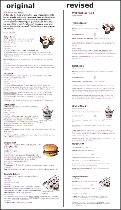
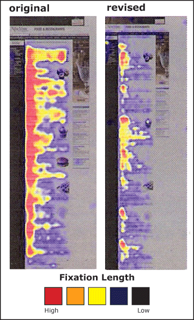
    Implication? Can we get over the longing for the “good old days” when supposedly people sat and read the newspaper cover to cover? It is clear that once engaged, the online reader stays with the text of a story longer than the newsprint reader. What might this mean for online news design. Does this, for example, argue for the placement of supplemental links 3/4ths of the way down the news story since interested readers seem to get that far?

    Reading styles:

    There were two reading styles revealed in the research – methodical readers and scanners. The “methodical” reader is described as someone who reads from top to bottom, without scanning, moving down the page / screen and sometimes going back to re-read material. The “scanner” would move quickly from headline to photos to reading part of a story without going back to the same place in the text. The eyetracking showed:

  • 75% of print readers were methodical.
  • Online readers were evenly split between methodical and scanners.
    Implication? In the newsprint world one size, by necessity, fits all – and a majority of readers have developed a habit of newspaper reading fits the medium. Not so online. One of the ongoing challenges for online news design is accommodating readers with different levels of interest – how do you provide both the quick hit news and in-depth content. Now, knowing that the audience is split between two different types of readers, how can online news be designed to engage both types of behaviors. Would it be a reader service to provide alternative second level story pages – one designed in regular column format with few graphic distractions for the methodical reader and one with multiple story sets with images and graphics to facilitate scanning behavior?

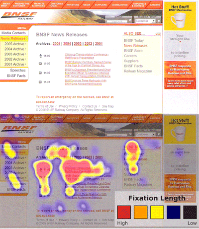
    Reading entry points:

    The first stop and second stop points, those places where the eye initially and secondarily fixated, differed by medium:

  • Broadsheet: Headlines then photos
  • Tabloid: Photos then teasers (directionals)
  • Online: Navigation bar / teasesrs (directionals) then headlines or ads
    Implication? Giving online readers guidance to where content can be found and featuring / teasing to stories you want to showcase will get their attention. Headlines guide readers to those stories they might be interested in and, once they are interested, those stories will be read quite thoroughly. There is much more to be studied about how this finding might help lead readers to stories that fulfill that “need to know” mission of the news organization.

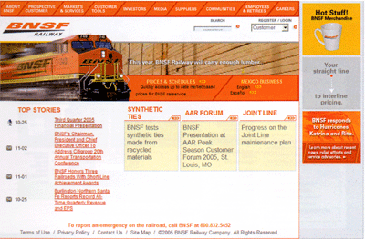
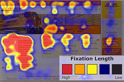
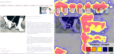
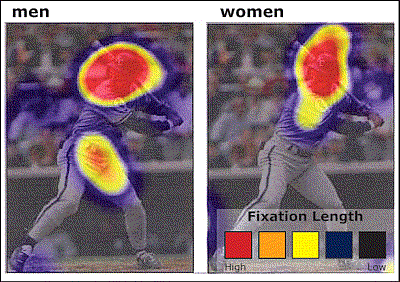
    How graphics were viewed:

    Different graphic elements drew the attention of different media readers:

  • Broadsheet: Explanatory graphics drew the most “eye stops.”
  • Tabloid: Charts were most frequently viewed.
  • Online: 88% of the eye stops on graphics went to maps, including weather and traffic.
    Implication? The Web is a learner’s medium. Maps provide specific, actionable information, particularly when it is constantly refreshed with the latest information (as with weather or traffic.) This also might argue for greater attention to the use of mash-ups as a way to display geo-specific information and reference.

    What got looked at online?

    The eye stops data from the online readers was analyzed to see what content elements were most frequently fixated on by users. Here is the heartening, or depressing, statistics on what, out of 11,400 eye stops, got viewed:

  • Story lists: 35%
  • Teasers / directionals: 27%
  • Ads: 18%
  • Blogs: 4%
  • Photo galleries: 3%
  • Podcasts: 1%
    Implications? Segmenting content by its form (photo gallery, blog, podcast) rather than by its subject content may well be marginalizing.

    Interesting future research might look at how packaging relevant alternative material with key related news stories improves the use of this supplemental information as the Washington Post does with its sidebar links to a collection of relevant photos or to “Who’s Blogging?” that specific article.

    These are just some of the preliminary findings from what promises to be a deep and much discussed research project. Project leaders Sarah Quinn and Pegie Stark Adam have provided online news designers and those interested in deeper research into what works, and why, online with a rich vein of data and I, for one, am looking forward to the final report of findings. If you are, too, information can be found at http://eyetrack.poynter.org/.

  • Eyetracking points the way to effective news article design

    When one of world’s best-known usability experts, Jakob Nielsen, conducts eyetracking research to test what his usability work has shown, the results generate some beneficial tips for online editors. This is what happened in late 2005, when Nielsen and Kara Pernice Coyne, the Nielsen/Norman Group’s director of research, conducted an eyetracking test with 255 people in New York City.

    With a little more than half of the participants (63 percent) ages 30 to 49, the test generated results applicable to the target audience for most news sites. Additionally, 20 percent were 18-29 and 16 percent were 50-64. Fifty-eight percent were female, 42 percent were male. Every test subject was given 50 tasks to complete. Sessions with each test subject lasted about one to two hours.

    Coyne (who we interviewed for this column) stresses that crucial to understanding the testing results is an awareness of the user’s motivation or goal behind each task. Some of the testing scenarios included asking the user to “read the news” or “read/learn”, making a number these results particularly helpful to journalists. She said eyetracking is valuable in these cases because it indicates not only where our users look, but where key usability problems exist.

    “[With eyetracking] we can see that a user may navigate the page of an interface that houses the info she wants,” she said, “but if the text is poorly presented, or the navigation is cluttered, or there are too many superfluous images so she cannot easily find what she needs. This is a lost opportunity.”

    We’ve featured three of the more interesting journalistic study results below.

    Featured finding #1:
    Rewrite + reformat = remember

    What if you could engage users in a story for about half the time, yet have them remember about 34 percent more of the content? That’s exactly what one test showed. Spending less than two hours rewriting and reformatting a story about New York City restaurants really paid off according to this study.

    The image below shows the two stories tested:

    Image
    The original version (left) was revised to increase white space, make the main idea concise, remove unnecessary images, shorten lines of text and add a graphic for each restaurant ranking. (Nielsen/Norman Group images, used with permission)

    The eyetracking data is featured in the image below. Red areas indicate the areas where the fixation length (or the length of time the users spent look at that area of the screen) was longest. Dark areas indicate low or no fixation length on that part of the presentation.

    Image
    Users spent a longer amount of time (about one minute) viewing the original version of the content (left) but remembered 34 percent less than those who received the reformatted story (right). In both cases a greater amount of time was spent on the left-hand side of the page. (Nielsen/Norman Group images, used with permission)

    Nielsen and Coyne also ran a similar test with more complicated content – a story from the New York Times about Australians receiving the Nobel Prize for Bacterium work. The results were similar. Changing the story presentation to text with:

  • bulleted items
  • subheadlines
  • tighter writing
    increased comprehension by 12 percent, with readers of the reformatted text indicating that they were more satisfied with the experience.

    Coyne calls these results “cool,” but adds that they were not unexpected.

    “We have seen many striking results like this over the years,” she said, “so were not tremendously surprised by it. It makes sense too. If a user is comfortable, not hindered by clutter and superfluous words, and can scan the main points, he will get the summary of the article quickly and easily. Formatting for the Web goes a long, long way.”

    So what?
    What do these results mean for online journalists? Take the time to rewrite and reformat print stories for online if you want users to:

  • get through a story more quickly
  • remember more of the content
  • be more satisfied with the story experience.

    Coyne’s direct advice for online journalists includes making sure that no matter what, all pages and articles have clear well-written headlines at the top that users can scan to:

  • see what the article is about
  • confirm they are on the page they want to be on.
    “Without [good headlines and subheadlines] people … need to read the text to figure out what the article is about,” she said. “But some people, many people, simply won’t do this. They will just move on.”

    She adds that overall, online stories can benefit from more concise writing, front-loaded with the main point first.

    “Assume people will only read the first few words of a line,” she said, “so bulleted lists are always good, as is bolding or creating links from important, information-bearing words.”

    Featured finding #2:
    Precise and relevant editing = successful design

    On home pages and story level pages, eye patterns indicated that text that isn’t precise and images that aren’t information-bearing don’t get looks, amounting to wasted space. For example, here is a test Web page where users were directed to “read news.”

    Image
    This BNSF Railway page was tested by Nielsen and Coyne. Users were sent to this page and directed to “read news.” (Nielsen/Norman Group image, used with permission)

    The hotspot below shows that the image of the train did not get eye fixations and that users eyes traveled around the page – not directly to the “top stories,” which is where the site’s news is located.

    Image
    Users did find the “top stories” and spent the most time there, but only after traveling the page and making fixations in other areas. (Nielsen/Norman Group image, used with permission)

    A different version of the BNSF page also was tested. The page and its corresponding hotspot are featured below. Notice that the longest eye fixations are on the area labeled “News Releases,” where the main stories are and where the site designers intended to direct them. Users seemed to find exactly what they needed and stay there when information was more clearly labeled. Again, the more “decorative” image gets no fixations.

    Image
    Another page of the BNSF Railway site and its corresponding hotspot. (Nielsen/Norman Group images, used with permission)

    So what?
    These results indicate that every item on a news Web page needs precise and thoughtful editing. As indicated above in Featured Finding #1, users will read only the two-to-three words of a headline (a result that also was found in Poynter’s Eyetrack III study, http://poynter.org/eyetrack and seen in the hotspots from the first Digital Storytelling Effects Lab’s initial study, http://disel-project.org.)

    Moreover images with little information are ignored. (More on this in next section.)

    Coyne’s top three suggestions for online news designers are:

  • present text in a way that is easy to scan on the Web
  • create a simple navigational structure
  • replace useless graphics with useful ones or with white space.

    She adds news organizations need to stop taking their design cues from their print ancestors, even though a motivated user may put up with a poor Web design.

    “[News Web sites] need to reformat for the Web medium,” she said. “But, users who are very interested in an article will read through it, even if it is presented as a wall of text. So the print format is not the worst for these very motivated users.”

    Featured finding #3:
    Photos edited for relevance = photos viewed

    In the case of Web design a picture isn’t always worth those thousand words. According to Coyne users treat pages with superfluous images like obstacle courses: The images create barriers to content. Moreover, Nielsen and Coyne concluded that images appearing unneeded, at least peripherally, will be erroneously tuned out.

    The types of images that get attention share these attributes:

  • Related to the content
  • Clear
  • Feature approachable people (clearly can see faces; people shown are smiling/looking at the camera)
  • Feature areas of private anatomy.

    In addition, the team says that individuals look at “real people” more than they do at images of models. Most assume that content that features models are advertisements, so they avoid it.

    Take a look at this page from dancworks.com. Users were given the task to find out more about Mickhail Baryshnikov. Their eye traveled around almost all parts of the page, but the photo, which was more decorative than informational.

    Image
    The danceworks.com site features an image of a dancer’s feet, which gets no fixations. (Nielsen/Norman Group images, used with permission)

    Conyne recommends designers avoid the generic pictures that are often used just for the sake of having a picture.

    “For example,” she said, “if an article is about a signature meal at a restaurant, say a tuna dish, display a scrumptious-looking picture of the plate of food. Don’t show a generic picture of a spoon and fork, as many sites do.”

    When photos do contain people related to the task at hand, or the content users are exploring, they do get fixations. However, gender makes a distinct difference on what parts of the photo are stared at the longest. Take a look at the hotspot below.

    Although both men and women look at the image of George Brett when directed to find out information about his sport and position, men tend to focus on private anatomy as well as the face. For the women, the face is the only place they viewed.

    Image
    This image of George Brett was part of a larger page with his biographical information. All users tested looked the image, but there was a distinct difference in focus between men and women.

    Coyne adds that this difference doesn’t just occur with images of people. Men tend to fixate more on areas of private anatomy on animals as well, as evidenced when users were directed to browse the American Kennel Club site.

    So what?
    These results provide tips for selecting photos.

  • Know your audience
  • Know the accompanying content and how photos relate to it. Is it decorative or informational?
  • When choosing between equally informative photos of people, be sure to use ones of “real” people, smiling, looking at the camera — not models which tend to been seen as photos accompanying ads.

    According to Coyne, sites that do design well include NYTimes.com and TheOnion.com.

    “I am used to The New York Times,” she said. “But even more than being used to it, I like the content and the way they present it. The titles are succinct and look clearly like links- blue, bold. The images are crisp. The text is legible. All the most important information is there on the homepage, as opposed to the BBC.com where you need to click around to get any real information. The Onion also packs a lot of headlines on the page, so you can scan a lot before you choose to read further. That’s nice.”

    Coming in April:
    An interview with Poynter Eyetrack ‘07 researchers.

    Coming in May:
    DiSEL research results about:

  • the design and placement of “Breaking News” and supplemental links
  • how people move through different slide show designs