Using games to help readers understand the news

With more journalistic sites using games as an interactive way to package content, a $250,000 grant from the Knight Foundation’s News Challenge contest will help one nonprofit news site take these games to the next level.

A pioneer in this format, The Gotham Gazette has featured games about New York City policy issues that are an effective and entertaining way for users to weigh decisions and deal with consequences.

Online Journalism Review spoke to Gotham Gazette Editor-in-Chief Gail Robinson about what makes a successful game and why they work well for journalistic sites. Proving good games can be built on a modest budget, Robinson discussed why simplicity works but dumbing down doesn’t.

Online Journalism Review: How did you first become interested in utilizing games at the Gotham Gazette?

Robinson: In 2002 there were a lot of discussions about what to do with the World Trade Center site, so we created a game [Ground Zero Planner] to let people try to envision what they wanted the site to look like, and we got quite a good response.

We’re very focused on New York City policy, and we try to make the material accessible and interesting to people, not just to policy wonks or people who work for city government or bureaus. So our games [become] almost a story set to a game.

OJR: How do you actually conceptualize and build these games?

Robinson: As the editor-in-chief, I’ll be involved and we have a technical director and a design director. We don’t have an illustrator on staff and we’ll probably get [a freelancer] to do the technical work. But probably the writing and content will all be done in house.

OJR: How involved are the journalists on staff in the creative process?

Robinson: In the past we were very involved. [For example] The Budget Game sort of jumped out at us. The city was having a lot of problems after 9/11, so we thought it would be good to dramatize that by letting people make choices with the caveat that because the city was legally required to balance the budget, you couldn’t play the game unless you balanced it.

There were other similar games, so we did a lot of research and played a lot of other games. And then we came up with assignments and writers were assigned to various aspects. I’ve written a lot about education so [I researched] how much would it cost for x number of teachers.

OJR: What kind of content works well when it’s incorporated in this game format?

Robinson: Almost anything can work with a game if you have an intelligent way of flushing it out– I think it’s important to not be too complicated. That doesn’t mean you can’t have people making lots of choices, or you can’t have graphics and animation. But I look at some games where I feel like they’re asking me to do too many things, to play too many roles.

OJR: You do have a consistent thread of simplicity that runs throughout your games.

Robinson: What we tried to do was create something simple that would show people the story but would still be fun to play. I think you get a lot of that enjoyment partly through the animation and the way you present material.

The infrastructure game called Breakdown is basically a glorified quiz. But we had a wonderful clip of animation showing ways that New York was going to crumble under it’s own weight. And my son who was then 11 (who I don’t think has a lot of interest in New York City infrastructure) loved that animation and played the game several times and then he showed it to his friends. I think that indicates how you can build something straightforward and still make it a lot of fun.

OJR: Can games stand alone as a good storytelling technique or are they best purposed as part of a package?

Robinson: I think they can stand alone. For example, someone can make a decision about something like how to build an affordable housing project in New York. Just by playing the game, the user would probably learn about some of the tradeoffs and then could click on things for more information.

In our case the story is sort of behind the game, and it can be incorporated into the game itself or it could [stem from] a separate article. We’ve actually done both here. The Judges Game [was inspired by] the big probe of whether the bench is basically bought and sold. It had actually started out as an article and then we built the game.

OJR: The games on your site are effective because they help users to understand the consequences of their decisions.

Robinson: Right, that’s what we’re hoping for. That was a big thing with the budget game. People say I don’t have a cop on my corner and why is my child is in a class with 20 students and why are my taxes so high? And this is a really good way [to illustrate that] because you see the money go up or down. You see what things cost to make it clear that you couldn’t have both really low taxes and pay for really tiny classes.

OJR: Do users expect to win when they play games? What kind of reward do they expect aside from obtaining information?

Robinson: We haven’t had winning in these games. For example there’s obviously not a right way to plan Ground Zero, and if there is one the city still hasn’t discovered it. As for winners and losers, my sense is we would like to try both models and determine what people prefer. Part of the Knight project (in general) is to get information out there that other people can use.

On games where people don’t win we hope we’re offering an educational tool. We’re also hoping to get answers back from the readers that we will share with decision makers in the city and [incorporate the responses] into articles.

OJR: From your standpoint what are the technical challenges of building a news game?

Robinson: Knight wants everything to be open source here and that’s probably our biggest challenge. Most games are done in Flash and we can’t use Flash.

OJR: What are some of the games you’re considering now?

Robinson: All the games are pretty tentative at this point because we’ve always let the news dictate the games to some extent. We’ve always had a news peg on the games.

One of the games we’re considering is related to garbage in New York. It’s an endless issue here and it’s one of those situations where there’s no ideal wonderful solution.

In the course of this grant there will be two important political campaigns, one being the presidential and congressional race. Then as the grant ends in 2009 we’ll be right in the middle of electing a mayor, so we imagine we’d somehow want to address that.

OJR: Have you learned anything about what doesn’t work with these games?

Robinson: I think they do have to be clear. I think we have one game that didn’t work–The NYC Preservation Game–although I’m not sure all my colleagues agree with me. I think we could never really decide what exactly we wanted to do with it. We could never figure out if it was a quiz where you’re trying to decide what makes a building a landmark or if you’re playing landmark commissioner.

So it just seems to be that the game has to be well designed and have a clear purpose, whether you’re playing a role or making decisions.

OJR: How do you strike the balance between entertaining and the balance of delivering the news?

Robinson: I think you can do both [if] you keep information very solid. Don’t talk down to someone just because it’s a game. You can put people in interesting, genuinely challenging situations.

Also I think the visuals on these games are enormously important. You’re not debasing the information if you have really clever animation. You’re just engaging people in another way. If you put a really ripping, entertaining lead on a news feature you’re going to pull people into the news feature who might not normally want to read about that subject, and it certainly doesn’t downgrade or dumb down the information that follows.

OJR: How can indie web publishers add a game element to their site if they lack the budget and have technical constraints?

Robinson: That’s one thing I think that Knight is hoping we’ll come up with ways to do. [All the grant winners] are going to be writing, blogging and sharing ideas with each other about that. I assume the plan is to make those ideas available to people. I hope people can learn from what we did right and also learn from our mistakes.

Navigating slide shows: What do people choose when every choice is possible?

During the month of May we rented the Tobii eyetracker to conduct a variety of studies about online news design decisions. Different designs for displaying “breaking news” and supplemental links were tested. We also looked at three variations of New York Times story level pages (the difference was the intensity and variety of supplemental information links available.) All three of these studies need some time to digest the data (from both the eyetracking behavior recorded and the survey responses by the participants.) They will be reported on in later columns.

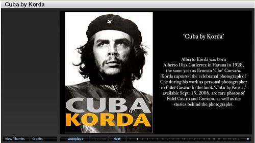
But as a little “add-on” study, we asked 34 of the people who did one of the other tests to also take a look at the Washington Post’s “Cuba by Korda” slide presentation.

Image

We were interested in seeing how people decided to navigate through this package which included every possible option for moving through the slides.

There was a thumbnail view:

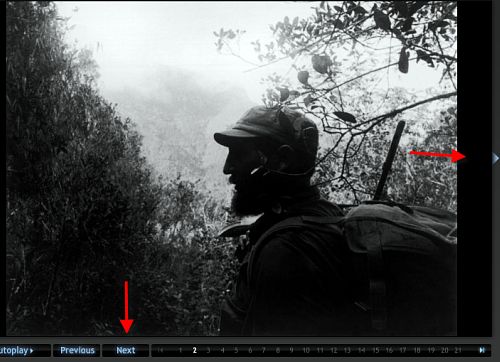
Image

You could click on an arrow next to the photo to go forward or back. Or you could use the “Next” button.

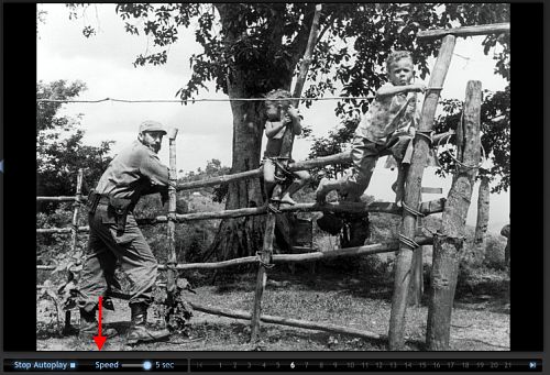
Image

There was an “autoplay” option that let you change the speed of the slide transitions.

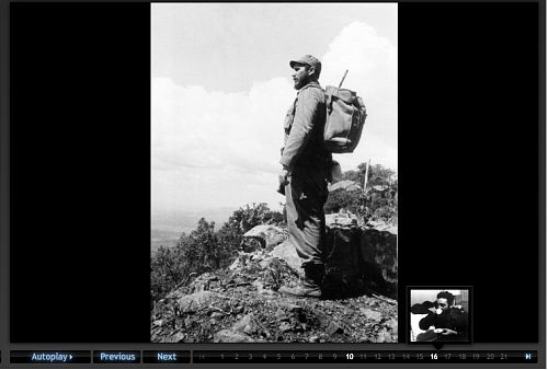
Image

Or you could click on the individual numbers lined along the bottom which would reveal a thumbnail of the image associated with that number.

Image

We had a number of questions about use of this complicated navigational suite.

  • Given all these options – which one(s) did the user select?
  • Did one navigation style result in more complete viewing of the images?
  • Did people move linearly or non-linearly through the set of slides?
  • Did one navigation style result in more complete reading of the associated narrative?

    With this study we simply sent people to the site and asked them to look through the package as they would if a friend had sent them the link. There were no instructions about how long to look, just to go through the site until they had had enough. We did not ask them any questions about the experience or their preferences, we just recorded their eye-movements on the screen. Here’s what we found in an analysis of the eyetrack recordings:

    Navigation choice

    Of the 34 participants, their first navigational choice:

  • Next 19 (56%)
  • Numbers 8 (23%)
  • Arrow 5 (15%)
  • Autoplay 2 ( 6%)
  • Thumbnail 0

    11 of the 34 switched between two different navigation methods, and 3 of those 11 used three methods (not repeating any of them.)

    Of the 19 that started with the “Next” button:

  • 13 used “Next” the entire time
  • 4 used “Next” for an average of 7 slides then went to autoplay
  • 1 went to the thumbnails, looked at a few, then clicked on numbers
  • 1 clicked on numbers

    Of the 8 that started with the Numbers

  • 7 clicked through the Numbers the entire time
  • 1 went to “autoplay” after clicking on five numbers

    Number of slides viewed

    The average number of the 40 slides in the package viewed by those who used one method the whole time:

  • Next – 28 (70%)
  • Arrow – 25 (62%)
  • Numbers – 12 (30%)

    Nine of the 34 participants viewed all 40 of the slides – all of them started with the “next” method of navigating the slides. Seven of those nine used “next” the whole time, the other two went to “autoplay” to view the rest of the stack.

    For all the participants – the average number of slides viewed was 23.

    Time spent

    The average time spent with the slide show package was 2:55. The longest time was 8:17 (a young woman of Hispanic background – carefully read all the slide information). The shortest was 0:48. With these outliers removed, the average time spent was 2:49.

    For people who stayed with one method, here’s the amount of time they spent with the slides:

  • Next – 2:34
  • Arrow – 3:31
  • Numbers – 2:16

    Linearity

    One of the possibilities in designing online presentation is the option of moving through material linearly or non-linearly. Two of the navigation options facilitated non-linear exploration of the material – the “numbers” and the “thumbnails.” No one started with the “thumbnails” and of the eight who started with the “numbers” half of them clicked the numbers in order (linearly), the other half clicked around in random order. Of the half that clicked linearly, the average number of slides viewed was 20.75. Of the half that clicked randomly, the average number of slides viewed was only 6.5.

    Reading

    We viewed all the eyetrack recordings to see whether the participant read the related text about each slide.

  • Eleven (33%) of the participants carefully read the slide text
  • Sixteen (47%) skimmed or read the text sporadically
  • Seven (20%) did not look at the slide captions

    There was no predominant method of viewing the slides that resulted in a more careful reading of the text. Of the eleven seen as carefully reading the text, 4 used the “number”, 3 used the “next”, 3 used the “arrow”, and one used “autoplay”

    Observations

    In terms of practical advice, this observation of navigational methods use makes clear that if you can only have one navigation method – the “next” method, moving linearly through the set of slides is the one to use. It was the primary choice of the majority of the participants and resulted in viewing the most slides.

    However, if amount of time spent with the story package is your primary goal, people who clicked from slide to slide using the “arrow” spent almost a minute longer than the “next” users.

    The reason for some of the other observations (for example, why no one selected the “thumbnail” view as an initial navigation method and why so few (2) selected autoplay) is not known – we did not ask people about their choices (or about their possible confusion about the choices.) This would be an interesting project for a future time – to do more of a “think aloud” session about people’s navigational choices. But this observational study does provide some insights into the choices made by people faced with a variety of methods for navigating to through rich and deep slide shows.

    But perhaps the most interesting observation was the very low level usage of the non-linear approach (and when it was used, how few slides were observed.) Is the linear orientation to looking through material so hard-wired into our media usage that it is, and will continue to be, the preferred way to take in media? Even when it was visual information – as this was – and did not logically need to follow a narrative thread – people preferred to move through in the order it was presented. What does this observation tell us about innovation in digital storytelling and our audience’s tolerance for new design paradigms.

  • Animated infographics and online storytelling: Words from the wise

    Sometimes the best research is the voice of experience. Alberto Cairo, former director of infographics and multimedia at elmundo.es in Madrid, is known worldwide for the work he has done using animated graphics as a powerful storytelling tool. While at elmundo.es, his staff won more NetMedia, Malofiej, and Society for News Design awards than any other publication in the world. In the 2004 edition of the SND.ies, the Society for News Design’s Best of New Media Design competition, Cairo’s department won the first gold medal ever given for breaking-news coverage.

    Now an assistant professor at the University of North Carolina-Chapel Hill (and a colleague of co-columnist Laura Ruel), Cairo has been taken his hands-on knowledge and moved it into the classroom. Here is a link to some of his students’ work: http://www.albertocairo.com/jomc/projects/index_projects.html.

    Graphic
    International animated infographics expert Alberto Cairo is writing his first book, Visual Journalism: Print and Multimedia Infographics Storytelling.

    Many online journalists are anticipating the book’s release, which should be in 2008, because there is an urgent need for the guidelines it provides. So, below we have offered you a form of a “sneak peek” – Cairo’s advice for multimedia storytelling using informational graphics.

    Q: Define animated infographics and describe why they are a powerful storytelling tool for journalists?

    A: Traditional infographics consist of the use of the tools of graphic design, illustration, cartography and statistical representation to convey journalistic information. Web infographics increase the number of tools to include the ones of online storytelling: 3D and 2D animation, interactivity, audio and video.

    Infographics are difficult to define precisely because of their multiple and flexible nature. Almost any informative representation where verbal and visual elements are combined, and that is intended to tell a news story, can be considered an infographic.

    Infographics have been crucial throughout the history of journalism to explain things that could not have been told otherwise. It is obvious that there is not better way to display large sets of data than with a good statistical chart, or to provide geographical context to a story than with a map. In my book I explain that, on an abstract level, an information graphic is an aid to thinking and understanding. This is not a new idea, of course. A good infographic makes patterns arise, discovers trends, condenses enormous amounts of information in a very small space.

    To understand why infographics are so important to modern journalism, try to think about stories such as September 11th, the invasion of Iraq or the shootings at Virginia Tech without them.

    Q: What are three current examples of excellent animated infographics? Why are they effective?

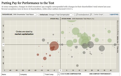
    A: The New York Times has the best statistical online infographics in the news industry at the moment. They have finally understood that in the Internet era infographics cannot be just static, linear representations. Sometimes you have to let the reader transform the information and play with it. You have to let the readers adapt the data to their needs.

    Graphic
    Cairo believes that the work of nytimes.com is some of the best online inforgraphic storytelling. The graphic above is one where users can interact and “play” with the numbers themselves.

    Among the best recent multimedia coverage, I would highlight the Times’ interactive about the Virginia Tech shootings. The combination of audio, video and information
    graphics makes this breaking news coverage one of the best I’ve ever seen. You see, almost any publication can create a good long-term, feature project online. It is much, much more difficult to do that in a tight deadline.

    Graphic
    The Times’ ability to create quality animated storytelling on deadline is noteworthy, according to Cairo.

    With their most recent hires, The New York Times is trying to emulate the model we used at elmundo.es back in 2000-2005. The are focusing more on breaking stories, rather than on features. Don’t get me wrong, features are great, but a newspaper should focus first on up-to-date information.

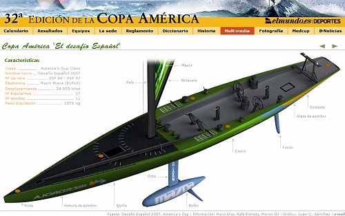
    The best animated diagrams can still be found in Spanish news organizations. Elpais.es and Elmundo.es keep publishing great linear explanations. Athough their work is still a great source of inspiration for professionals worldwide, both news organizations need
    to think about new ways of presenting information. They cannot continue to succeed if you by using the same formula over and over again. In the current environment, your work gets dated quickly if you do so.

    Graphic
    Spanish news organizations, such as elmundo.es, still are producing the best animated diagrams and linear explanations.

    There are news organizations in the United States that currently are taking steps in the right direction. I would mention The Dallas Morning News, San Jose Mercury News, and The Boston Globe. The Sun-Sentinel is still a major reference for multimedia graphics as well.

    Q: What are the most common mistakes multimedia journalists make when creating animated infographics? How can they avoid them?

    A: The first and gravest mistake that individuals make believing that infographics are a branch of graphic design or that they have anything to do with illustration.

    Infographics, like any other form of journalism storytelling rely on solid, accurate content. It is great if you can create cool 3-D animations and great interactive scenes, but if your content is weak, the presentation will be weak. There are not good infographics without good reporting.

    As a second mistake is the fact that many people think that online infographics can be created just by “translating” print pieces to the Web. Unfortunately, this is what is happening in many newsrooms worldwide. That’s the wrong approach because what you usually end with is with a still picture with a bunch of roll-over buttons. In order to create a great multimedia infographics piece, you have to think about it from the very beginning, on the planning process, rather than consider it a subsidiary element that depends on the content generated by the print side. Print and online use different languages that share the same root grammar. They are dialects.

    Q: Can you provide us with a checklist of questions for editors to ask themselves when deciding if an animated infographic is the best storytelling method for a given topic?

    A: Checklist:

  • Can the story be explained using a map, a statistical chart or a diagram? If you need to show the “where” of the story, you definitely need a map.
  • Are there size, length, distance, amount comparisons involved? Then, you need a chart.
  • Is there any process or procedure hat can be better understood by means of a visual display? Create a diagram.
  • Do you need to recreate the scene where the story took place? In this case: do you have enough information to recreate it accurately, without making up details? This is crucial. The old infographics motto says: if you don’t know how it is, don’t draw it. I’ve added my own corollary to that motto: if you don’t know how it moves, don’t animate it.
  • [More suggestions from Cairo at: http://www.albertocairo.com/infografia/articulos/2006/design.html
    http://www.albertocairo.com/imagenes/articlesndsummer.pdf]

    Q: What suggestions do you have for individuals in an online newsroom who want to begin creating animated infographics?

    A: It’s quite simple: give it a try. You don’t need to be a Flash guru to create online infographics. Learning just the basics (something that can be done in two or three days of training) can give you the main tools needed to start working. Then, with experience, you will incorporate new tools and techniques. That’s the path we followed at elmundo.es back in 2000. Nobody in my team had any experience.

    The conceptual side is also extremely important: you need to educate yourself. Read about the psychology of vision. Understanding the basics of cognitive science is crucial. Study cartography, statistics and information design. There are many great books out there.

    Q: What are some things the industry can do now to challenge itself to move in the right direction with multimedia infographics?

    A: Understand that to obtain profits, you have to invest in training, equipment, innovation and good staff. Cutting expenses might be good in the short term, but it will hurt quality in the long term. The quantitative evidence suggests that publications that increase quality and focus more on stories the readers care about (not necessarily local stories) don’t lose readership – or they lose it in such a slow, steady pace that it will give them time to become completely online. Innovation is crucial in this equation: create new ways to convey information.

    If you want to survive in the current environment, you have to attract online readers by offering them content presented in ways they will not be able to find anywhere else. Any citizen journalist can present information using words or pictures. It is much more difficult to find good user-generated multimedia or infographics content. Engage your readers by offering them breaking-news, accurate and spectacular infographics presentations. My experience in events such as the March 11th 2004 terrorist attacks in Madrid tells me that readers really appreciate the efforts.

    Graphic
    Elmundo.es’ March 11 graphic got millions of page views in just a few days.

    Other breaking-news presentations at elmundo.es did not generate so many visits, but they were extremely successful in other ways. In some cases, they were local breaking-news stories. Again, any newspaper can do an infographic on the latest NASA mission, but only a few can do a sophisticated online presentation on the state-of-the art steel bridge that is being built right next door. You have to find the right balance between global and local. Never forget one of them because you’re focusing too much on the other.

    Q: Who has influenced you most as a professional?

    A: The people I’ve worked with: the folks at La Voz de Galicia, Spain, who accepted me as an intern. My partners at Diario16, DPI Comunicacion and elmundo.es, of course.

    After that, almost anything I read or see influences me. I am like a sponge. My own students have a huge influence on the way I think about infographics, too, especially those that participate in our multimedia documentary projects. When they participate in those projects they are usually a few months away from graduation and cannot be considered mere undergraduates anymore. They are professionals ready to get an entry-level job as infographics journalists – and to surprise you with their creativity.