L.A. Times uses mapping, databases to build interactive homicide map

Eric Ulken is the editor, interactive technology, for latimes.com. He also is a former student editor for OJR.

I’d like to draw your attention to a new feature that launched on latimes.com this week: The Homicide Map is a visual interface to the Homicide Report, Times reporter Jill Leovy’s effort to chronicle every homicide in Los Angeles County.

As of July 30, The Times has counted 496 homicides in L.A. County. While the Homicide Report focuses on the individual victims, this tool helps users analyze the broader geographic and demographic trends within that staggering figure.

The Homicide Map enables users to:

  • Filter homicides by victim’s race, gender, cause of death, and other parameters
  • Find homicides near an address and/or ZIP code
  • View photos of victims and link to Leovy’s reports (and the sometimes heartbreaking user comments that accompany them)
  • Get customized updates on an RSS reader or in Google Earth

    We’re excited about the marriage of great Times reporting with a data-rich visual interface.

  • Animated infographics and online storytelling: Words from the wise

    Sometimes the best research is the voice of experience. Alberto Cairo, former director of infographics and multimedia at elmundo.es in Madrid, is known worldwide for the work he has done using animated graphics as a powerful storytelling tool. While at elmundo.es, his staff won more NetMedia, Malofiej, and Society for News Design awards than any other publication in the world. In the 2004 edition of the SND.ies, the Society for News Design’s Best of New Media Design competition, Cairo’s department won the first gold medal ever given for breaking-news coverage.

    Now an assistant professor at the University of North Carolina-Chapel Hill (and a colleague of co-columnist Laura Ruel), Cairo has been taken his hands-on knowledge and moved it into the classroom. Here is a link to some of his students’ work: http://www.albertocairo.com/jomc/projects/index_projects.html.

    Graphic
    International animated infographics expert Alberto Cairo is writing his first book, Visual Journalism: Print and Multimedia Infographics Storytelling.

    Many online journalists are anticipating the book’s release, which should be in 2008, because there is an urgent need for the guidelines it provides. So, below we have offered you a form of a “sneak peek” – Cairo’s advice for multimedia storytelling using informational graphics.

    Q: Define animated infographics and describe why they are a powerful storytelling tool for journalists?

    A: Traditional infographics consist of the use of the tools of graphic design, illustration, cartography and statistical representation to convey journalistic information. Web infographics increase the number of tools to include the ones of online storytelling: 3D and 2D animation, interactivity, audio and video.

    Infographics are difficult to define precisely because of their multiple and flexible nature. Almost any informative representation where verbal and visual elements are combined, and that is intended to tell a news story, can be considered an infographic.

    Infographics have been crucial throughout the history of journalism to explain things that could not have been told otherwise. It is obvious that there is not better way to display large sets of data than with a good statistical chart, or to provide geographical context to a story than with a map. In my book I explain that, on an abstract level, an information graphic is an aid to thinking and understanding. This is not a new idea, of course. A good infographic makes patterns arise, discovers trends, condenses enormous amounts of information in a very small space.

    To understand why infographics are so important to modern journalism, try to think about stories such as September 11th, the invasion of Iraq or the shootings at Virginia Tech without them.

    Q: What are three current examples of excellent animated infographics? Why are they effective?

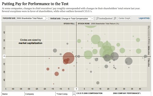
    A: The New York Times has the best statistical online infographics in the news industry at the moment. They have finally understood that in the Internet era infographics cannot be just static, linear representations. Sometimes you have to let the reader transform the information and play with it. You have to let the readers adapt the data to their needs.

    Graphic
    Cairo believes that the work of nytimes.com is some of the best online inforgraphic storytelling. The graphic above is one where users can interact and “play” with the numbers themselves.

    Among the best recent multimedia coverage, I would highlight the Times’ interactive about the Virginia Tech shootings. The combination of audio, video and information
    graphics makes this breaking news coverage one of the best I’ve ever seen. You see, almost any publication can create a good long-term, feature project online. It is much, much more difficult to do that in a tight deadline.

    Graphic
    The Times’ ability to create quality animated storytelling on deadline is noteworthy, according to Cairo.

    With their most recent hires, The New York Times is trying to emulate the model we used at elmundo.es back in 2000-2005. The are focusing more on breaking stories, rather than on features. Don’t get me wrong, features are great, but a newspaper should focus first on up-to-date information.

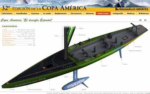
    The best animated diagrams can still be found in Spanish news organizations. Elpais.es and Elmundo.es keep publishing great linear explanations. Athough their work is still a great source of inspiration for professionals worldwide, both news organizations need
    to think about new ways of presenting information. They cannot continue to succeed if you by using the same formula over and over again. In the current environment, your work gets dated quickly if you do so.

    Graphic
    Spanish news organizations, such as elmundo.es, still are producing the best animated diagrams and linear explanations.

    There are news organizations in the United States that currently are taking steps in the right direction. I would mention The Dallas Morning News, San Jose Mercury News, and The Boston Globe. The Sun-Sentinel is still a major reference for multimedia graphics as well.

    Q: What are the most common mistakes multimedia journalists make when creating animated infographics? How can they avoid them?

    A: The first and gravest mistake that individuals make believing that infographics are a branch of graphic design or that they have anything to do with illustration.

    Infographics, like any other form of journalism storytelling rely on solid, accurate content. It is great if you can create cool 3-D animations and great interactive scenes, but if your content is weak, the presentation will be weak. There are not good infographics without good reporting.

    As a second mistake is the fact that many people think that online infographics can be created just by “translating” print pieces to the Web. Unfortunately, this is what is happening in many newsrooms worldwide. That’s the wrong approach because what you usually end with is with a still picture with a bunch of roll-over buttons. In order to create a great multimedia infographics piece, you have to think about it from the very beginning, on the planning process, rather than consider it a subsidiary element that depends on the content generated by the print side. Print and online use different languages that share the same root grammar. They are dialects.

    Q: Can you provide us with a checklist of questions for editors to ask themselves when deciding if an animated infographic is the best storytelling method for a given topic?

    A: Checklist:

  • Can the story be explained using a map, a statistical chart or a diagram? If you need to show the “where” of the story, you definitely need a map.
  • Are there size, length, distance, amount comparisons involved? Then, you need a chart.
  • Is there any process or procedure hat can be better understood by means of a visual display? Create a diagram.
  • Do you need to recreate the scene where the story took place? In this case: do you have enough information to recreate it accurately, without making up details? This is crucial. The old infographics motto says: if you don’t know how it is, don’t draw it. I’ve added my own corollary to that motto: if you don’t know how it moves, don’t animate it.
  • [More suggestions from Cairo at: http://www.albertocairo.com/infografia/articulos/2006/design.html
    http://www.albertocairo.com/imagenes/articlesndsummer.pdf]

    Q: What suggestions do you have for individuals in an online newsroom who want to begin creating animated infographics?

    A: It’s quite simple: give it a try. You don’t need to be a Flash guru to create online infographics. Learning just the basics (something that can be done in two or three days of training) can give you the main tools needed to start working. Then, with experience, you will incorporate new tools and techniques. That’s the path we followed at elmundo.es back in 2000. Nobody in my team had any experience.

    The conceptual side is also extremely important: you need to educate yourself. Read about the psychology of vision. Understanding the basics of cognitive science is crucial. Study cartography, statistics and information design. There are many great books out there.

    Q: What are some things the industry can do now to challenge itself to move in the right direction with multimedia infographics?

    A: Understand that to obtain profits, you have to invest in training, equipment, innovation and good staff. Cutting expenses might be good in the short term, but it will hurt quality in the long term. The quantitative evidence suggests that publications that increase quality and focus more on stories the readers care about (not necessarily local stories) don’t lose readership – or they lose it in such a slow, steady pace that it will give them time to become completely online. Innovation is crucial in this equation: create new ways to convey information.

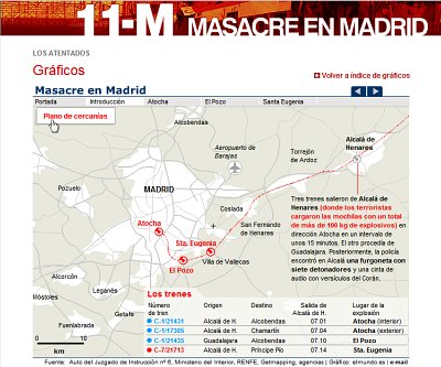
    If you want to survive in the current environment, you have to attract online readers by offering them content presented in ways they will not be able to find anywhere else. Any citizen journalist can present information using words or pictures. It is much more difficult to find good user-generated multimedia or infographics content. Engage your readers by offering them breaking-news, accurate and spectacular infographics presentations. My experience in events such as the March 11th 2004 terrorist attacks in Madrid tells me that readers really appreciate the efforts.

    Graphic
    Elmundo.es’ March 11 graphic got millions of page views in just a few days.

    Other breaking-news presentations at elmundo.es did not generate so many visits, but they were extremely successful in other ways. In some cases, they were local breaking-news stories. Again, any newspaper can do an infographic on the latest NASA mission, but only a few can do a sophisticated online presentation on the state-of-the art steel bridge that is being built right next door. You have to find the right balance between global and local. Never forget one of them because you’re focusing too much on the other.

    Q: Who has influenced you most as a professional?

    A: The people I’ve worked with: the folks at La Voz de Galicia, Spain, who accepted me as an intern. My partners at Diario16, DPI Comunicacion and elmundo.es, of course.

    After that, almost anything I read or see influences me. I am like a sponge. My own students have a huge influence on the way I think about infographics, too, especially those that participate in our multimedia documentary projects. When they participate in those projects they are usually a few months away from graduation and cannot be considered mere undergraduates anymore. They are professionals ready to get an entry-level job as infographics journalists – and to surprise you with their creativity.

  • Eyetracking points the way to effective news article design

    When one of world’s best-known usability experts, Jakob Nielsen, conducts eyetracking research to test what his usability work has shown, the results generate some beneficial tips for online editors. This is what happened in late 2005, when Nielsen and Kara Pernice Coyne, the Nielsen/Norman Group’s director of research, conducted an eyetracking test with 255 people in New York City.

    With a little more than half of the participants (63 percent) ages 30 to 49, the test generated results applicable to the target audience for most news sites. Additionally, 20 percent were 18-29 and 16 percent were 50-64. Fifty-eight percent were female, 42 percent were male. Every test subject was given 50 tasks to complete. Sessions with each test subject lasted about one to two hours.

    Coyne (who we interviewed for this column) stresses that crucial to understanding the testing results is an awareness of the user’s motivation or goal behind each task. Some of the testing scenarios included asking the user to “read the news” or “read/learn”, making a number these results particularly helpful to journalists. She said eyetracking is valuable in these cases because it indicates not only where our users look, but where key usability problems exist.

    “[With eyetracking] we can see that a user may navigate the page of an interface that houses the info she wants,” she said, “but if the text is poorly presented, or the navigation is cluttered, or there are too many superfluous images so she cannot easily find what she needs. This is a lost opportunity.”

    We’ve featured three of the more interesting journalistic study results below.

    Featured finding #1:
    Rewrite + reformat = remember

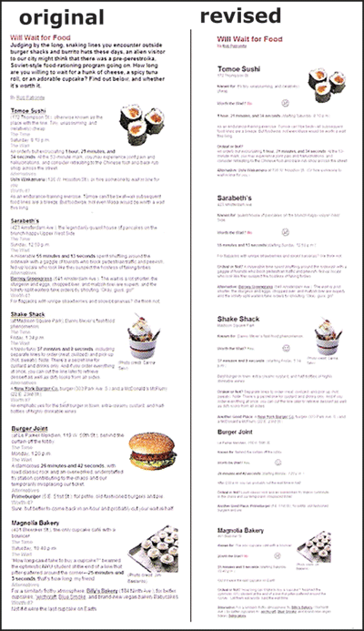
    What if you could engage users in a story for about half the time, yet have them remember about 34 percent more of the content? That’s exactly what one test showed. Spending less than two hours rewriting and reformatting a story about New York City restaurants really paid off according to this study.

    The image below shows the two stories tested:

    Image
    The original version (left) was revised to increase white space, make the main idea concise, remove unnecessary images, shorten lines of text and add a graphic for each restaurant ranking. (Nielsen/Norman Group images, used with permission)

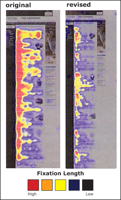
    The eyetracking data is featured in the image below. Red areas indicate the areas where the fixation length (or the length of time the users spent look at that area of the screen) was longest. Dark areas indicate low or no fixation length on that part of the presentation.

    Image
    Users spent a longer amount of time (about one minute) viewing the original version of the content (left) but remembered 34 percent less than those who received the reformatted story (right). In both cases a greater amount of time was spent on the left-hand side of the page. (Nielsen/Norman Group images, used with permission)

    Nielsen and Coyne also ran a similar test with more complicated content – a story from the New York Times about Australians receiving the Nobel Prize for Bacterium work. The results were similar. Changing the story presentation to text with:

  • bulleted items
  • subheadlines
  • tighter writing
    increased comprehension by 12 percent, with readers of the reformatted text indicating that they were more satisfied with the experience.

    Coyne calls these results “cool,” but adds that they were not unexpected.

    “We have seen many striking results like this over the years,” she said, “so were not tremendously surprised by it. It makes sense too. If a user is comfortable, not hindered by clutter and superfluous words, and can scan the main points, he will get the summary of the article quickly and easily. Formatting for the Web goes a long, long way.”

    So what?
    What do these results mean for online journalists? Take the time to rewrite and reformat print stories for online if you want users to:

  • get through a story more quickly
  • remember more of the content
  • be more satisfied with the story experience.

    Coyne’s direct advice for online journalists includes making sure that no matter what, all pages and articles have clear well-written headlines at the top that users can scan to:

  • see what the article is about
  • confirm they are on the page they want to be on.
    “Without [good headlines and subheadlines] people … need to read the text to figure out what the article is about,” she said. “But some people, many people, simply won’t do this. They will just move on.”

    She adds that overall, online stories can benefit from more concise writing, front-loaded with the main point first.

    “Assume people will only read the first few words of a line,” she said, “so bulleted lists are always good, as is bolding or creating links from important, information-bearing words.”

    Featured finding #2:
    Precise and relevant editing = successful design

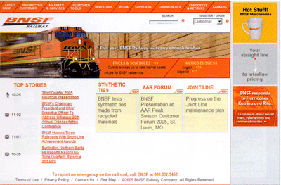
    On home pages and story level pages, eye patterns indicated that text that isn’t precise and images that aren’t information-bearing don’t get looks, amounting to wasted space. For example, here is a test Web page where users were directed to “read news.”

    Image
    This BNSF Railway page was tested by Nielsen and Coyne. Users were sent to this page and directed to “read news.” (Nielsen/Norman Group image, used with permission)

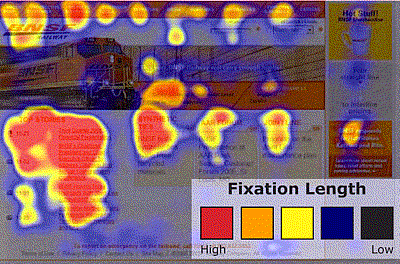
    The hotspot below shows that the image of the train did not get eye fixations and that users eyes traveled around the page – not directly to the “top stories,” which is where the site’s news is located.

    Image
    Users did find the “top stories” and spent the most time there, but only after traveling the page and making fixations in other areas. (Nielsen/Norman Group image, used with permission)

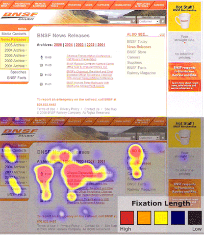
    A different version of the BNSF page also was tested. The page and its corresponding hotspot are featured below. Notice that the longest eye fixations are on the area labeled “News Releases,” where the main stories are and where the site designers intended to direct them. Users seemed to find exactly what they needed and stay there when information was more clearly labeled. Again, the more “decorative” image gets no fixations.

    Image
    Another page of the BNSF Railway site and its corresponding hotspot. (Nielsen/Norman Group images, used with permission)

    So what?
    These results indicate that every item on a news Web page needs precise and thoughtful editing. As indicated above in Featured Finding #1, users will read only the two-to-three words of a headline (a result that also was found in Poynter’s Eyetrack III study, http://poynter.org/eyetrack and seen in the hotspots from the first Digital Storytelling Effects Lab’s initial study, http://disel-project.org.)

    Moreover images with little information are ignored. (More on this in next section.)

    Coyne’s top three suggestions for online news designers are:

  • present text in a way that is easy to scan on the Web
  • create a simple navigational structure
  • replace useless graphics with useful ones or with white space.

    She adds news organizations need to stop taking their design cues from their print ancestors, even though a motivated user may put up with a poor Web design.

    “[News Web sites] need to reformat for the Web medium,” she said. “But, users who are very interested in an article will read through it, even if it is presented as a wall of text. So the print format is not the worst for these very motivated users.”

    Featured finding #3:
    Photos edited for relevance = photos viewed

    In the case of Web design a picture isn’t always worth those thousand words. According to Coyne users treat pages with superfluous images like obstacle courses: The images create barriers to content. Moreover, Nielsen and Coyne concluded that images appearing unneeded, at least peripherally, will be erroneously tuned out.

    The types of images that get attention share these attributes:

  • Related to the content
  • Clear
  • Feature approachable people (clearly can see faces; people shown are smiling/looking at the camera)
  • Feature areas of private anatomy.

    In addition, the team says that individuals look at “real people” more than they do at images of models. Most assume that content that features models are advertisements, so they avoid it.

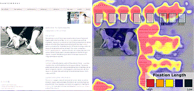
    Take a look at this page from dancworks.com. Users were given the task to find out more about Mickhail Baryshnikov. Their eye traveled around almost all parts of the page, but the photo, which was more decorative than informational.

    Image
    The danceworks.com site features an image of a dancer’s feet, which gets no fixations. (Nielsen/Norman Group images, used with permission)

    Conyne recommends designers avoid the generic pictures that are often used just for the sake of having a picture.

    “For example,” she said, “if an article is about a signature meal at a restaurant, say a tuna dish, display a scrumptious-looking picture of the plate of food. Don’t show a generic picture of a spoon and fork, as many sites do.”

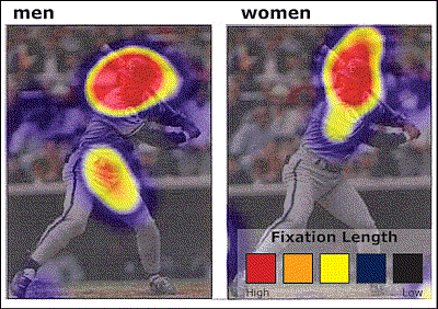
    When photos do contain people related to the task at hand, or the content users are exploring, they do get fixations. However, gender makes a distinct difference on what parts of the photo are stared at the longest. Take a look at the hotspot below.

    Although both men and women look at the image of George Brett when directed to find out information about his sport and position, men tend to focus on private anatomy as well as the face. For the women, the face is the only place they viewed.

    Image
    This image of George Brett was part of a larger page with his biographical information. All users tested looked the image, but there was a distinct difference in focus between men and women.

    Coyne adds that this difference doesn’t just occur with images of people. Men tend to fixate more on areas of private anatomy on animals as well, as evidenced when users were directed to browse the American Kennel Club site.

    So what?
    These results provide tips for selecting photos.

  • Know your audience
  • Know the accompanying content and how photos relate to it. Is it decorative or informational?
  • When choosing between equally informative photos of people, be sure to use ones of “real” people, smiling, looking at the camera — not models which tend to been seen as photos accompanying ads.

    According to Coyne, sites that do design well include NYTimes.com and TheOnion.com.

    “I am used to The New York Times,” she said. “But even more than being used to it, I like the content and the way they present it. The titles are succinct and look clearly like links- blue, bold. The images are crisp. The text is legible. All the most important information is there on the homepage, as opposed to the BBC.com where you need to click around to get any real information. The Onion also packs a lot of headlines on the page, so you can scan a lot before you choose to read further. That’s nice.”

    Coming in April:
    An interview with Poynter Eyetrack ‘07 researchers.

    Coming in May:
    DiSEL research results about:

  • the design and placement of “Breaking News” and supplemental links
  • how people move through different slide show designs