The Best of the SND.ies

Judging online journalism awards always is a great opportunity to see the best work newsrooms are doing. But as those of us who have been competition judges know, we usually view entries in only a couple categories – best sports section, best online commentary, etc. We don’t get to see the full range of work that has been submitted.

That’s why judging the final round of the SND.ies awards, the Society for News Design’s Best of Multimedia Design Competition, can be an educational experience. This year, nine judges gathered in late August at the University of North Carolina-Chapel Hill for an intense two days of reviewing, discussing, and evaluating a wide variety of entries. Something unique about the SND.ies is the lack of a requirement that the judges designate a gold, silver or bronze winner in each category. There may, in fact, be no entries that make it to gold status, or silver, or any award level. It makes the discussion of each entry focused much more on its individual merits rather than comparing it with others in the category.

As a judge (Nora Paul) and the competition coordinator (Laura Ruel) we observed some distinct trends in multimedia design. Without revealing the winners (they will be announced on Oct. 13 at the SND awards banquet in Boston) we’d like to discuss the types of entries that we saw, the elevation in the quality of entries during the past few years, and the kinds of usability questions that this next level of multimedia seem to raise.

Five types of entries

First of all, we want to say how impressed we are with the variety of ways journalists are using multimedia forms to tell stories. This year, we observed five distinct types of entries:

  • Animated infographics
  • Infotoys
  • Narratives
  • You are there
  • BOPs (Big Ole Packages!)

    Animated infographics

    These entries are informational graphics that explain a sequence of events in an accident, or the steps in a process or show how something works. This type of presentation style has become more sophisticated and clean since the competition began in 2002. The influence of elmundo.es’ high quality work in this area is clear. Most of these entries have a simple, streamlined look, with an appropriate use of white space. They are basic line drawings that reveal complex working parts, and – in some cases – provide a linear explanation of a sequence of events.

    One of this year’s finalists, NYTimes.com’s recreation of Cory Lidle’s airplane crash into a New York apartment building, shows the power of animation to detail the sequence of events.

    It is educational to see how the initial, static graphic evolved into the animated infographic produced a few days later, after all the details of the ill-fated flight were available.


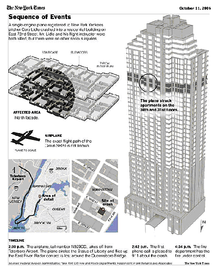
    Initial, static graphic for print publication.

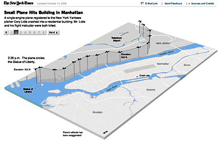
    Animated storytelling graphic

    Infotoys

    We like to call this “data you can play with.” Although we have seen this form in years past, this year’s entries seem to be pushing this storytelling method a bit further.

    Take a look at this package by indystar.com. It is an excellent use of a controlled, interactive graphic that lets users explore statistical information.


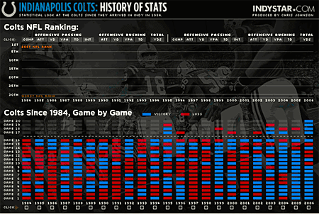
    Indystar.com used statistical data to provide an historical overview of the Colts.

    Another good example of customizable data came in the form of a NYTimes.com piece, “Is it Better to Buy or Rent?” This interactive helps consumers evaluate data in a changing market. It is extremely useful. The flexibility of the interface and the factors considered when providing advice about buying versus renting is sophisticated and easy to use. Moreover this presentation has a great shelf life. It can benefit readers for years to come.


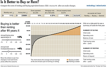
    This NYTimes.com interactive is an excellent example of being able to customize the content output based on your personal settings.

    “Infotoys” with crime data also made their way into the pool of entries. While this isn’t a new concept, inquirer.philly.com’s display does more than just take the data and marry it with a map. It takes it to another level by providing a simple interface that allows users to customize views. It also provides contextual information about the number of homicides.


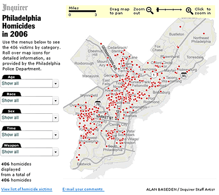
    Philadelphia Homicides in 2006 goes beyond the traditional crime data map.

    Multimedia narratives

    We’re categorizing these pieces as self-contained packages that follow a single – somewhat linear – narrative thread. This year we saw an excellent uses of images and increasingly well produced and well synced audio overlays. We believe the use of Soundslides, a production tool for still image and audio Web presentations, has helped journalists to focus more on the content and less on the technology. Consequently, they are moving multimedia narratives to a new, more advanced level.

    One example is Palmbeachpost.com’s simple, elegant, touching narrative about train jumping. It is well focused, simple and has great news value. Offering the presentation in both Spanish and English adds to its appeal.


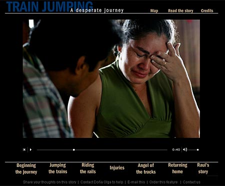
    Train Jumping by palmbeachpost.com is an impressive, touching multimedia narrative.

    You are there

    High level graphics and embedded POV/panoramic images are being used to create “you are there” packages that give users a sense of location and exploration. These allow the users the control to customize their viewing experiences.

    Elpais.es used beautiful 3D illustrations with just enough animation to let the user get a close-up look at Formula 1 racing.


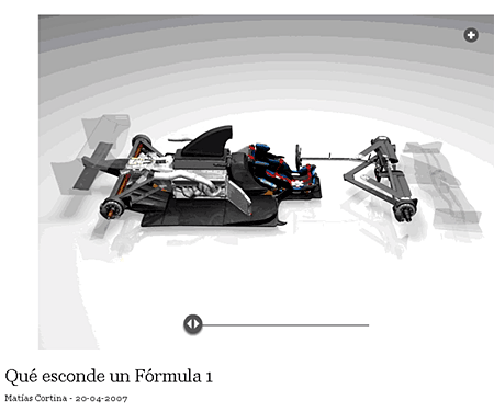
    Formula 1 racing comes to life with this elpais.com presentation.

    In “The Met’s New Greek and Roman Galleries” by NYTimes.com, 3-D renderings and panoramas place viewers inside a new area of the museum. It is a strong interactive that gives the user a large amount of control with clean 3-D work, smooth, easy-to-use panoramas and elegant design.


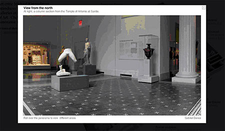
    NYTimes.com: The Met’s New Greek and Roman Galleries

    BOPs: Big Ole Packages

    BOPs are large compilations of storytelling materials such as the text, videos, audio slide shows, animated graphics and interactive applications. These ambitious packages tell complex stories with many layers of information. Two special challenges for producers of these pieces include:

  • Organization: Designers of the most successful of these story packages resisted the temptation to organize these pieces by media form. The winning entries didn’t use menu items such as “video,” “photos,” etc., but rather used descriptive story labels that summarized the story areas by topic.
  • Interface: With so much information, the most successful of these packages had navigation that helped spark user interest in the story. Navigation also was intuitive enough to allow people to easily and effortlessly find their way into all the material – and just easily find a way out.

    One example of a BOP is a St. Pete Times’ piece about Florida’s wetlands. In most cases it uses the best media forms to tell particular parts of the story. For example, an interactive graphic clearly explains how wetlands work. To add depth to the text stories, the designers use highlighted links to primary source documents that aid in revealing politicians’ true leanings. The videos, graphics and photos each complement each other without duplicating content.


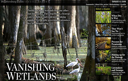
    This St. Pete Times’ Web presentation about an ecological crisis uses multiple forms of media to tell the story.

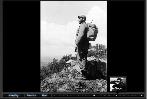
    Another BOP example is a class project by students from UNC-Chapel Hill, Universidad de los Andes and Universidad del Desarrollo that documents life in the Atacama Desert, Chile – the driest place on earth. The animated graphics, informative audio, powerful images and carefully chosen video combine to provide a great example of integrated multimedia storytelling.


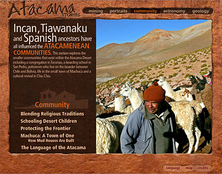
    Atacama Stories is a large-scale student project that combines storytelling methods to provide an in-depth look at this desert environment.

    The challenge

    It is clear from this competiton that the skills in multimedia use have become more sophisticated in some newsrooms and the styles that seem to be most effective are getting copied and re-used to very good effect. While this competition is about recognizing great work, the real winners are the news audience.

  • Navigating slide shows: What do people choose when every choice is possible?

    During the month of May we rented the Tobii eyetracker to conduct a variety of studies about online news design decisions. Different designs for displaying “breaking news” and supplemental links were tested. We also looked at three variations of New York Times story level pages (the difference was the intensity and variety of supplemental information links available.) All three of these studies need some time to digest the data (from both the eyetracking behavior recorded and the survey responses by the participants.) They will be reported on in later columns.

    But as a little “add-on” study, we asked 34 of the people who did one of the other tests to also take a look at the Washington Post’s “Cuba by Korda” slide presentation.

    Image

    We were interested in seeing how people decided to navigate through this package which included every possible option for moving through the slides.

    There was a thumbnail view:

    Image

    You could click on an arrow next to the photo to go forward or back. Or you could use the “Next” button.

    Image

    There was an “autoplay” option that let you change the speed of the slide transitions.

    Image

    Or you could click on the individual numbers lined along the bottom which would reveal a thumbnail of the image associated with that number.

    Image

    We had a number of questions about use of this complicated navigational suite.

  • Given all these options – which one(s) did the user select?
  • Did one navigation style result in more complete viewing of the images?
  • Did people move linearly or non-linearly through the set of slides?
  • Did one navigation style result in more complete reading of the associated narrative?

    With this study we simply sent people to the site and asked them to look through the package as they would if a friend had sent them the link. There were no instructions about how long to look, just to go through the site until they had had enough. We did not ask them any questions about the experience or their preferences, we just recorded their eye-movements on the screen. Here’s what we found in an analysis of the eyetrack recordings:

    Navigation choice

    Of the 34 participants, their first navigational choice:

  • Next 19 (56%)
  • Numbers 8 (23%)
  • Arrow 5 (15%)
  • Autoplay 2 ( 6%)
  • Thumbnail 0

    11 of the 34 switched between two different navigation methods, and 3 of those 11 used three methods (not repeating any of them.)

    Of the 19 that started with the “Next” button:

  • 13 used “Next” the entire time
  • 4 used “Next” for an average of 7 slides then went to autoplay
  • 1 went to the thumbnails, looked at a few, then clicked on numbers
  • 1 clicked on numbers

    Of the 8 that started with the Numbers

  • 7 clicked through the Numbers the entire time
  • 1 went to “autoplay” after clicking on five numbers

    Number of slides viewed

    The average number of the 40 slides in the package viewed by those who used one method the whole time:

  • Next – 28 (70%)
  • Arrow – 25 (62%)
  • Numbers – 12 (30%)

    Nine of the 34 participants viewed all 40 of the slides – all of them started with the “next” method of navigating the slides. Seven of those nine used “next” the whole time, the other two went to “autoplay” to view the rest of the stack.

    For all the participants – the average number of slides viewed was 23.

    Time spent

    The average time spent with the slide show package was 2:55. The longest time was 8:17 (a young woman of Hispanic background – carefully read all the slide information). The shortest was 0:48. With these outliers removed, the average time spent was 2:49.

    For people who stayed with one method, here’s the amount of time they spent with the slides:

  • Next – 2:34
  • Arrow – 3:31
  • Numbers – 2:16

    Linearity

    One of the possibilities in designing online presentation is the option of moving through material linearly or non-linearly. Two of the navigation options facilitated non-linear exploration of the material – the “numbers” and the “thumbnails.” No one started with the “thumbnails” and of the eight who started with the “numbers” half of them clicked the numbers in order (linearly), the other half clicked around in random order. Of the half that clicked linearly, the average number of slides viewed was 20.75. Of the half that clicked randomly, the average number of slides viewed was only 6.5.

    Reading

    We viewed all the eyetrack recordings to see whether the participant read the related text about each slide.

  • Eleven (33%) of the participants carefully read the slide text
  • Sixteen (47%) skimmed or read the text sporadically
  • Seven (20%) did not look at the slide captions

    There was no predominant method of viewing the slides that resulted in a more careful reading of the text. Of the eleven seen as carefully reading the text, 4 used the “number”, 3 used the “next”, 3 used the “arrow”, and one used “autoplay”

    Observations

    In terms of practical advice, this observation of navigational methods use makes clear that if you can only have one navigation method – the “next” method, moving linearly through the set of slides is the one to use. It was the primary choice of the majority of the participants and resulted in viewing the most slides.

    However, if amount of time spent with the story package is your primary goal, people who clicked from slide to slide using the “arrow” spent almost a minute longer than the “next” users.

    The reason for some of the other observations (for example, why no one selected the “thumbnail” view as an initial navigation method and why so few (2) selected autoplay) is not known – we did not ask people about their choices (or about their possible confusion about the choices.) This would be an interesting project for a future time – to do more of a “think aloud” session about people’s navigational choices. But this observational study does provide some insights into the choices made by people faced with a variety of methods for navigating to through rich and deep slide shows.

    But perhaps the most interesting observation was the very low level usage of the non-linear approach (and when it was used, how few slides were observed.) Is the linear orientation to looking through material so hard-wired into our media usage that it is, and will continue to be, the preferred way to take in media? Even when it was visual information – as this was – and did not logically need to follow a narrative thread – people preferred to move through in the order it was presented. What does this observation tell us about innovation in digital storytelling and our audience’s tolerance for new design paradigms.

  • Early lessons from Poynter's Eyetrack07

    The Poynter Institute has a long tradition of doing ground-breaking research. The latest is Eyetrack07, the fourth of their eyetracking projects over the past 16 years. They went to four cities (Denver, Minneapolis, Philadelphia, and St. Petersburg) to look at the patterns of reading in broadsheet, tabloid, and on- screen publications. In all, 600 participants (200 for each of the media) were tested.

    On April 10-12, the Poynter Institute held a conference – “EyeTrack07 – Discover Its Power” – billed as a pre-publication party (the book of findings is being edited by Dr. Pegie Stark Adam and is due out in June). Attendees included the vast team involved in the project, the news organizations that collaborated with them, and editors, researchers, and media consultants who hoped to find actionable insights from the findings.

    In the opening speech veteran news designer Mario Garcia presented a timeline of Poynter’s research work in the areas of design and reading patterns.

    The first, in 1990, used eyetracking equipment to see how people’s eyes moved around the printed news page. The key findings from this study included:

  • Readers enter a printed page thru the largest image on the page.
  • A majority read the headline before going to the text.
  • Photo captions were the third most frequently visited part of the page.
    These findings influenced newspapers’ use of photos on front pages and the understanding of how important clever headline writing is.

    The second, in 2000, focused on how people moved through news websites and found that, unlike with print, online readers entered the page through text and headlines – not images. This showed, as Dr. Garcia told the group, how the Web was more like a book in which people want their text in a flow uninterrupted by images. The rise of the photo slideshow was a response to this.

    The third, in 2004, further focused on online reading behavior. The study (conducted by co-columnist Laura Ruel with Steve Outing) used less invasive eyetracking equipment and relied on mocked up news pages to test different aspects of the online reading experience. Key findings from this study included:

  • Dominant heds most often draw the users eye first when entering the screen
  • Eyes fixated first in the upper left corner of the page.
  • Top navigation was most readily seen and used.
  • Shorter paragraphs were read more than longer ones.
  • Ads in the upper left and the top of the homepage received the most attention.
    Actionable advice from this study included the need for attention-grabbing words at the start of headlines, greater use of “chunking” text into short grafs, and the preference for one column formats for stories rather than multi-columns.

    What this study showed, too, was that larger font text was quickly scanned and smaller fonts engaged in depth reading. It was clear that reading was being done online.

    And that brings us to the latest Poynter eyetrack study – an attempt to discover differences in reading patterns between different media and formats of news presentation – broadsheet, tabloid, and online.

    The research team drew up a set of issues they hoped to have the project address:
    1. Have we lost our ability to read in depth?
    2. Are we a society of scanners?
    3. Has the newspaper habit disappeared from most people’s lives?
    4. In a multimedia society how can the various media compete and survive?
    5. Can a real fusion of online and print truly exist?
    6. Do readers actually read and retain info online?
    7. Are large formatted papers more likely to disappear than small format?
    8. What is the role of advertising in a multi-platform environment?
    9. What is the new definition of news?
    10. What role will mobile appliances play in newsgathering and disseminating?

    In 600 research sessions, they recorded participants’ eye movements as they looked through one of the three media formats, resulting in more than 102,000 “eye stops” (demonstration of significant interest in the element of the page / screen being looked at) which were coded and analyzed by researchers at the University of Florida. In all, over the course of five months, 30 days of published material was recorded:

  • 2,364 broadsheet stories (average no. of stories read – 11.8)
  • 2,188 tabloid stories (average no. of stories read – 10,0)
  • 2,306 online stories (average no. of stories read – 11.9)

    In the major findings revealed in the opening day of the session, a few of these questions were apparently addressed. Here are some of the conclusions from the research that are particularly relevant to online news reading in comparison to print reading behavior.

    Reading thoroughness:

    Once people chose what they wanted to read they read more thoroughly online than in print.

  • Online readers read both short and long stories more completely than either broadsheet or tabloid readers (online 62% of the text of stories longer than 19 inches was read compared to 52% in tabloid and 49% in broadsheet.)
  • Online readers, overall, read an average of 77% of the stories they chose to read.
    Implication? Can we get over the longing for the “good old days” when supposedly people sat and read the newspaper cover to cover? It is clear that once engaged, the online reader stays with the text of a story longer than the newsprint reader. What might this mean for online news design. Does this, for example, argue for the placement of supplemental links 3/4ths of the way down the news story since interested readers seem to get that far?

    Reading styles:

    There were two reading styles revealed in the research – methodical readers and scanners. The “methodical” reader is described as someone who reads from top to bottom, without scanning, moving down the page / screen and sometimes going back to re-read material. The “scanner” would move quickly from headline to photos to reading part of a story without going back to the same place in the text. The eyetracking showed:

  • 75% of print readers were methodical.
  • Online readers were evenly split between methodical and scanners.
    Implication? In the newsprint world one size, by necessity, fits all – and a majority of readers have developed a habit of newspaper reading fits the medium. Not so online. One of the ongoing challenges for online news design is accommodating readers with different levels of interest – how do you provide both the quick hit news and in-depth content. Now, knowing that the audience is split between two different types of readers, how can online news be designed to engage both types of behaviors. Would it be a reader service to provide alternative second level story pages – one designed in regular column format with few graphic distractions for the methodical reader and one with multiple story sets with images and graphics to facilitate scanning behavior?

    Reading entry points:

    The first stop and second stop points, those places where the eye initially and secondarily fixated, differed by medium:

  • Broadsheet: Headlines then photos
  • Tabloid: Photos then teasers (directionals)
  • Online: Navigation bar / teasesrs (directionals) then headlines or ads
    Implication? Giving online readers guidance to where content can be found and featuring / teasing to stories you want to showcase will get their attention. Headlines guide readers to those stories they might be interested in and, once they are interested, those stories will be read quite thoroughly. There is much more to be studied about how this finding might help lead readers to stories that fulfill that “need to know” mission of the news organization.

    How graphics were viewed:

    Different graphic elements drew the attention of different media readers:

  • Broadsheet: Explanatory graphics drew the most “eye stops.”
  • Tabloid: Charts were most frequently viewed.
  • Online: 88% of the eye stops on graphics went to maps, including weather and traffic.
    Implication? The Web is a learner’s medium. Maps provide specific, actionable information, particularly when it is constantly refreshed with the latest information (as with weather or traffic.) This also might argue for greater attention to the use of mash-ups as a way to display geo-specific information and reference.

    What got looked at online?

    The eye stops data from the online readers was analyzed to see what content elements were most frequently fixated on by users. Here is the heartening, or depressing, statistics on what, out of 11,400 eye stops, got viewed:

  • Story lists: 35%
  • Teasers / directionals: 27%
  • Ads: 18%
  • Blogs: 4%
  • Photo galleries: 3%
  • Podcasts: 1%
    Implications? Segmenting content by its form (photo gallery, blog, podcast) rather than by its subject content may well be marginalizing.

    Interesting future research might look at how packaging relevant alternative material with key related news stories improves the use of this supplemental information as the Washington Post does with its sidebar links to a collection of relevant photos or to “Who’s Blogging?” that specific article.

    These are just some of the preliminary findings from what promises to be a deep and much discussed research project. Project leaders Sarah Quinn and Pegie Stark Adam have provided online news designers and those interested in deeper research into what works, and why, online with a rich vein of data and I, for one, am looking forward to the final report of findings. If you are, too, information can be found at http://eyetrack.poynter.org/.